Harrington Garden Maintenance
Brand Identity Package for a Gardening Business

Initial Conversation
I was approached by Harrington Garden Maintenance to build their brand identity from the ground up. This involved creating a logo, business card, flyer, clothing and finally a website. We had a conversation about the types of people they would be cutting gardens for and the initial ideas they had about the brand themselves.
Logo Concepts
Concept 1 was this H within the shape of a flower. Concept 2 was a combination of a flower, leaf, tree and plant pot to create this all encompassing logomark. Concept 3 was a font with a leaf protruding from the serif of the H.
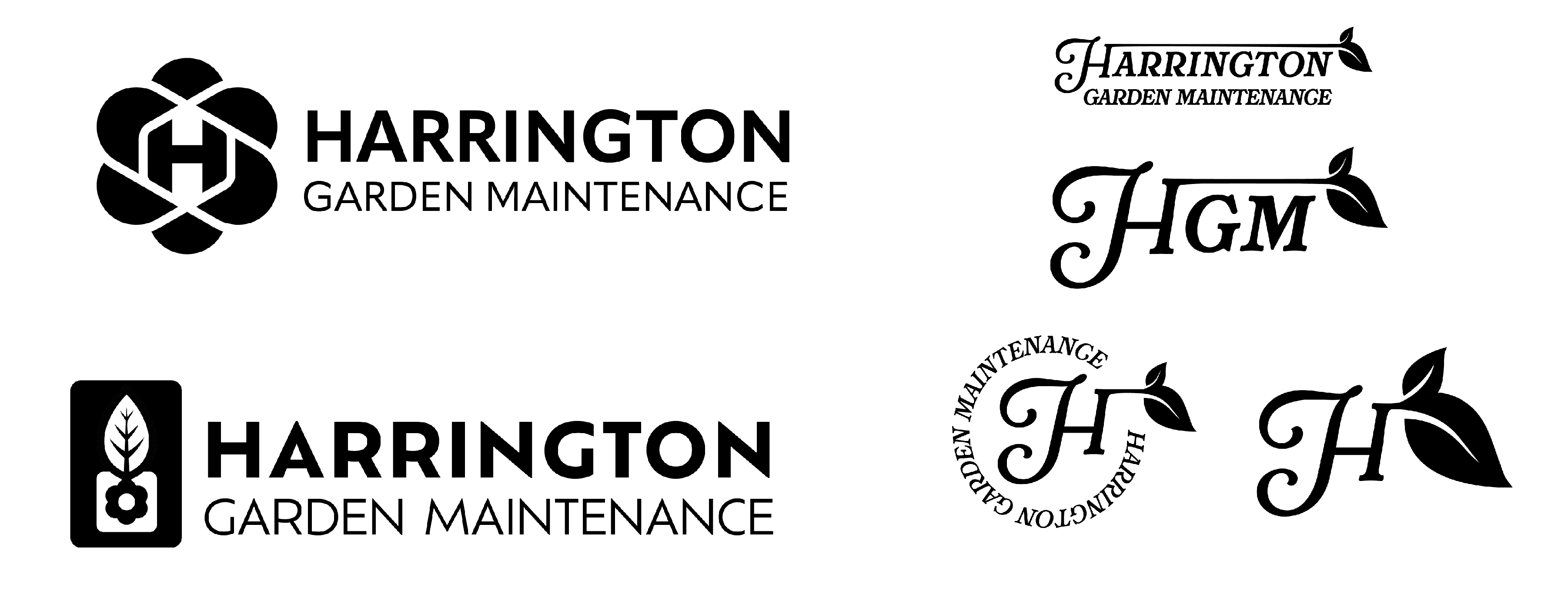
Once presented will the three options, the client decided on concept 3 and wanted to see some slight variations in colour and positioning.
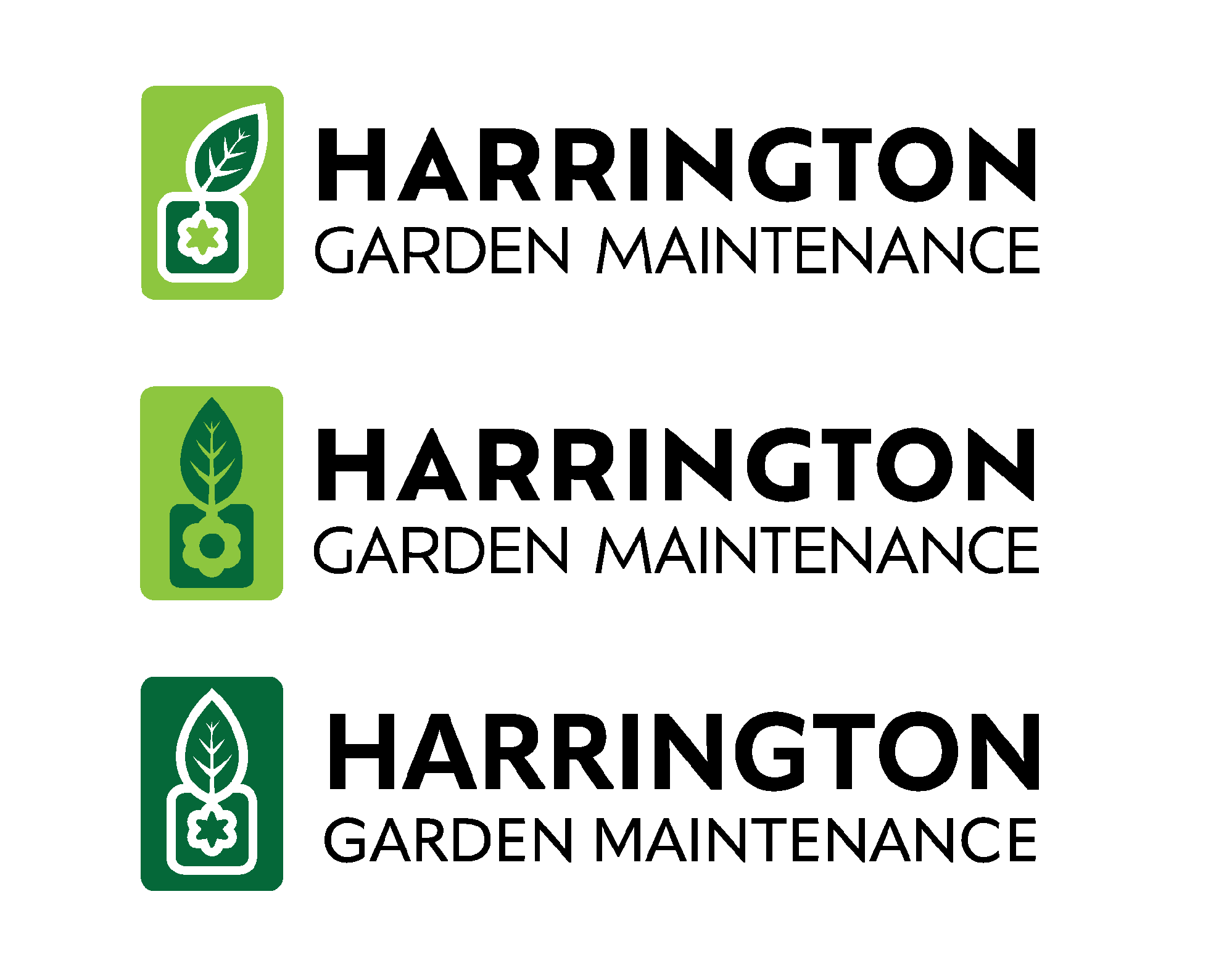
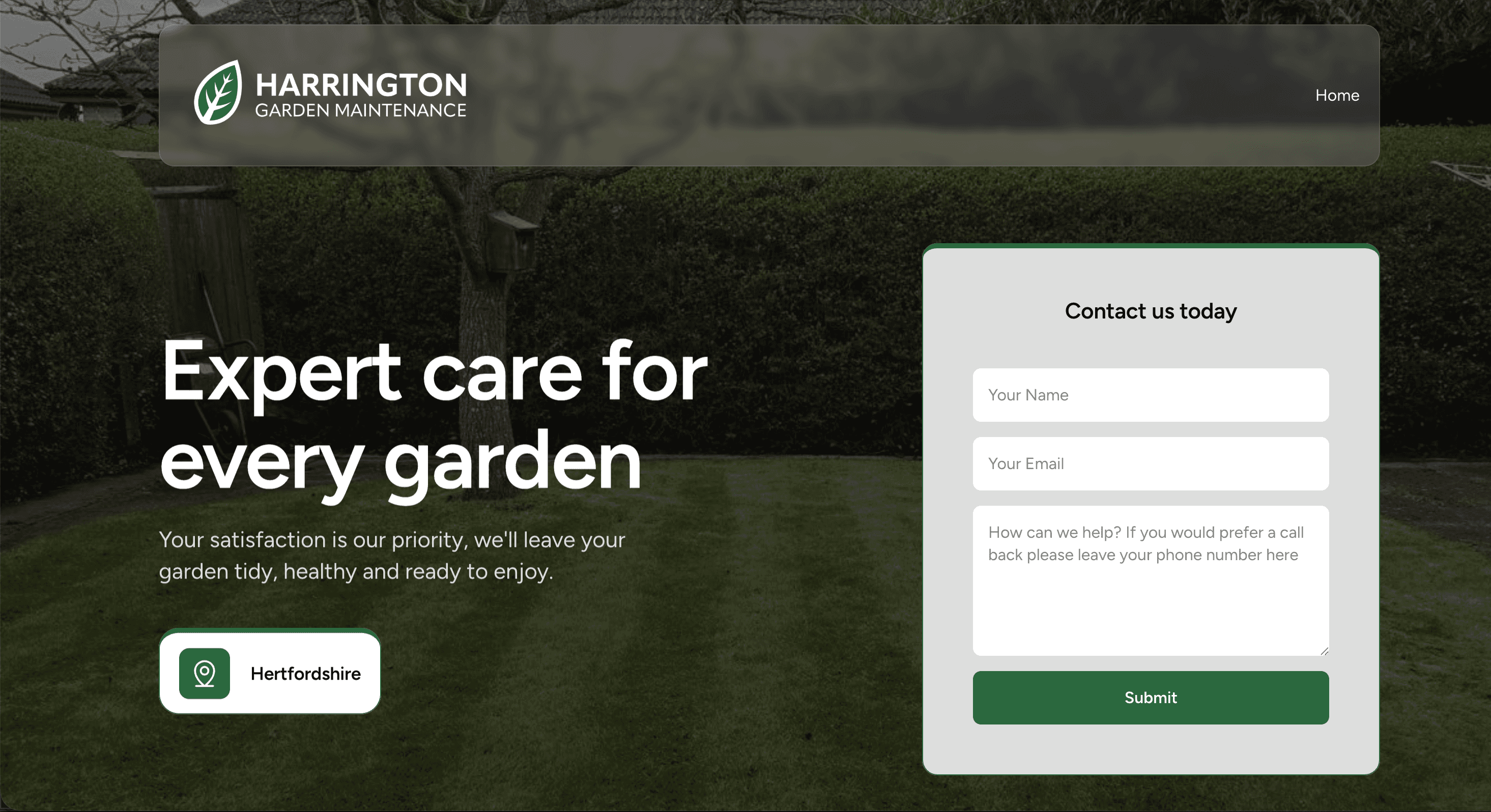
After some further conversations we decided to simplify the design down to just the leaf and build the visual language around this.

Flyer & Business Card Design
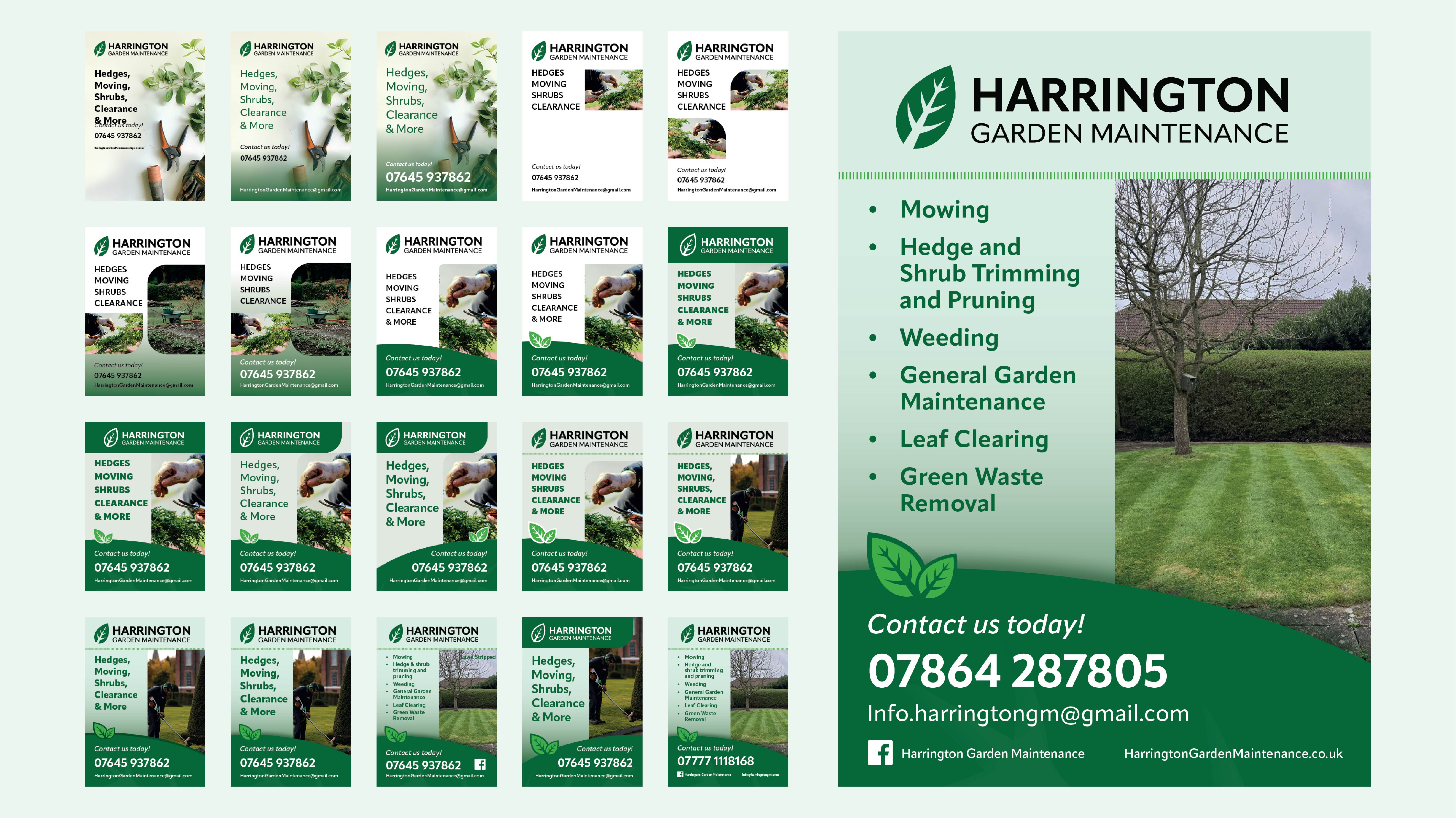
With the leaf now the focal point of the logo this asset now became a large part of the design of both he flyer and the card. For the Flyer the copy was kept to a minimum to retain the simplicity and keep the focus on the services provided and the contact information.
Website Design
By combining all of the previous design decisions and some photos provided by the client the creation of the website was a smooth experience.


More Projects