How Does Culture Alter the Development of Design Elements in Contemporary Print?
The DNA of a magazine changes over time for numerous reasons, the goal of this dissertation is to find out how culture alters the visual development of a magazine. This dissertation will firstly contextualise itself by explaining the history of contemporary magazines and the two magazines up for analysis, Eye and IDEA. Then there is an explanation of visual grammar to build understanding of the effects of graphical elements on the viewer. The magazines selected to be analysed were chosen with reference to a timeline which indicated when there was a change in editor or publisher (Figure 1 pg.6). The two international graphic design magazines were then critically analysed to discover how culture has affected the design decisions regarding the graphical elements. The dissertation argues that similarities in graphical elements across two cultures cannot be attributed to the same reason as cultures have differing reactions towards the same elements. This dissertation will show that the creation of a magazine and the elemental changes made are always a reaction to the surrounding culture. A magazine is built upon the symbiotic relationship between audience and editor. The purpose of the magazine is dictated by the culture and the attitudes towards the subject matter. Finally, the dissertation outlines how the use of different methodology, one that generates quantitative and qualitative data, would result in more accurate findings.
30 min read
Introduction
This essay is an exploration into the development of graphic design elements in print over time. This will be done through the lens of two respected international graphic design magazines: the British magazine ‘Eye’ and the Japanese magazine ‘IDEA’. I have done this by going through an archive of the magazines and documenting certain pages. When choosing which issues to document I referred to the timeline created during research (Figure 1 pg.6) which shows when there was a change in either the editor or publisher for both magazines. I tried to ensure I had the first and last issues of when either the editor or publisher changed. Unfortunately, there was not access to every issue, meaning some of the editor and publisher’s first additions to the magazine are missed. In this case, the earliest accessible issue after a change, was selected for analysis. As they are a quarterly magazine (Eye) and a bimonthly, turned quarterly magazine (IDEA), the issues selected are still within a year of the change. John L Walters, the current editor of Eye, describes a magazine as being
‘more than ‘content’. It is an artefact, a style choice, a treat, a mini-poster, a source of comfort or of tribal allegiance, and a way to shape thoughts and test opinions.’ (Walters, 2018). This illustrates the importance of the graphic elements of a magazine to entice and retain the reader, and therefore the need to develop a relevant style suited to the culture of the time and place of the magazine. The foundation of a magazine starts with the societal experiences of the editors, fine tuned into information and articles they believe will resonate the most with their audience. Therefore, the deconstruction and analysis of the magazines discloses reflections of the cultures at the time. Exploring the building blocks of Eye and IDEA will reveal how the cultures changed over time and in turn how these shifts in culture informed design decisions. In this analysis, the design elements are focused on more than the content, because the goal is to discover how and why the principles of graphic design change when faced with an ever-evolving audience, how much is carried forward from the past, along with how and when rules are broken to try to stand out. This essay will cover an explanation as to why these magazines were chosen, the history of both magazines and their contemporary predecessors, an explanation of the visual grammar that will be explored, the analysis of both magazines, a comparison of the changes found and a conclusion. Altogether this should inform the reader of the historical context alongside informed explanations of visual developments.
The limitations of my methods include the fact that visual grammar and the elements that constitute the pages ‘offer not a mirror of the world but an interpretation of it.’ (Midalia 1999 p. 131) and thus this essay cannot be taken as fact, but only as an interpretation of the surrounding culture at the time. I have made assumptions on the social semiotics of both, whilst only belonging to one culture myself. During the research process I also had to translate some papers and magazine articles from Japanese to English. Due to the lack of availability of every issue and the inability to analyse every single page, the elements photographed would be found in every issue, such as the cover, contents page and a recurring double page spread section. The sample collected is visually analysed and informed assumptions are made based on the visual changes, combined with secondary research. This includes interviews, editorials and articles from the editors themselves. Finding quotes from the older editors of IDEA proved difficult and so points are evidenced from the more recent editors speaking about the past. The selection process does mean there is a risk of generalisation and dilution of what happened over the course of both magazines’ histories. In order to limit this possibility, I have ensured a range of issues were reviewed and my research also covered more than what is shown within the analysis. This was done in an effort to visually see if any major changes occurred outside my original selection. Evidence of this research can be found in the appendix with the timelines of every contents page of every issue for both magazines (Figs. 45, 46).
Why compare Eye and IDEA?
Both are international graphic design magazines that are now published quarterly and have an overall overlap in content, but also some specific examples where they cover the same topic such as an exhibition. They are leading magazines within their field that understand the importance of, and take pride in, the actual design of a physical magazine and are collectable graphic design journals, designed with the goal to never be thrown away.
Japanese design was heavily influenced by western design after the second world war but, as time went on, they wanted to return to their roots and moved away from the westernisation of their design. This sentiment is echoed in an interview by Kiyonori Muroga, IDEA’s editor in chief from 2002-2018: ‘I think Japanese people are very much obsessed with questioning themselves, because our entire culture was questioned when western modernity forced its way into our society about one hundred and fifty years ago. The clash of “Sakoku”—the hermetic Japanese tradition that lasted form the 17th until the 19th century—and western modernity in the middle of the 19th century still echoes in our minds and culture, making us open for experiments and extremes, but also unstable.’ (Offermanns, 2016). This means that by analysing the magazine over the years we should be able to see a shift in IDEA’s design to align more with traditional Japanese design. Analysing IDEA and Eye makes sense as it is comparing a developing western design magazine with an eastern design magazine that is trying to evolve away from western design whilst maintaining its modernity.
By exploring two magazines with the same topic and ethos, the differences between the magazines could reveal how culture has altered the approach, design and attitude of the magazines. IDEA and Eye not only cover international design but also reach international audiences. Eye’s first 7 issues were written in English, German and French whereas IDEA has English translations of articles sporadically throughout its issues. This means it can be safely assumed that there is an overlap in readership between the two magazines. The content found in these magazines is a sample of what the audience at the time wanted to see. Dauppe agrees stating: ‘One aspect of the analysis of graphic design would be to better understand, through research, the cultural eye of the audience of that time which in turn relates to the cultural eye of the designer.’ (Dauppe, 2011: 7). There is a back-and-forth relationship between editor and audience, meaning through the analysis over the years, points can be discovered where culture has affected the design and the design has affected the culture.
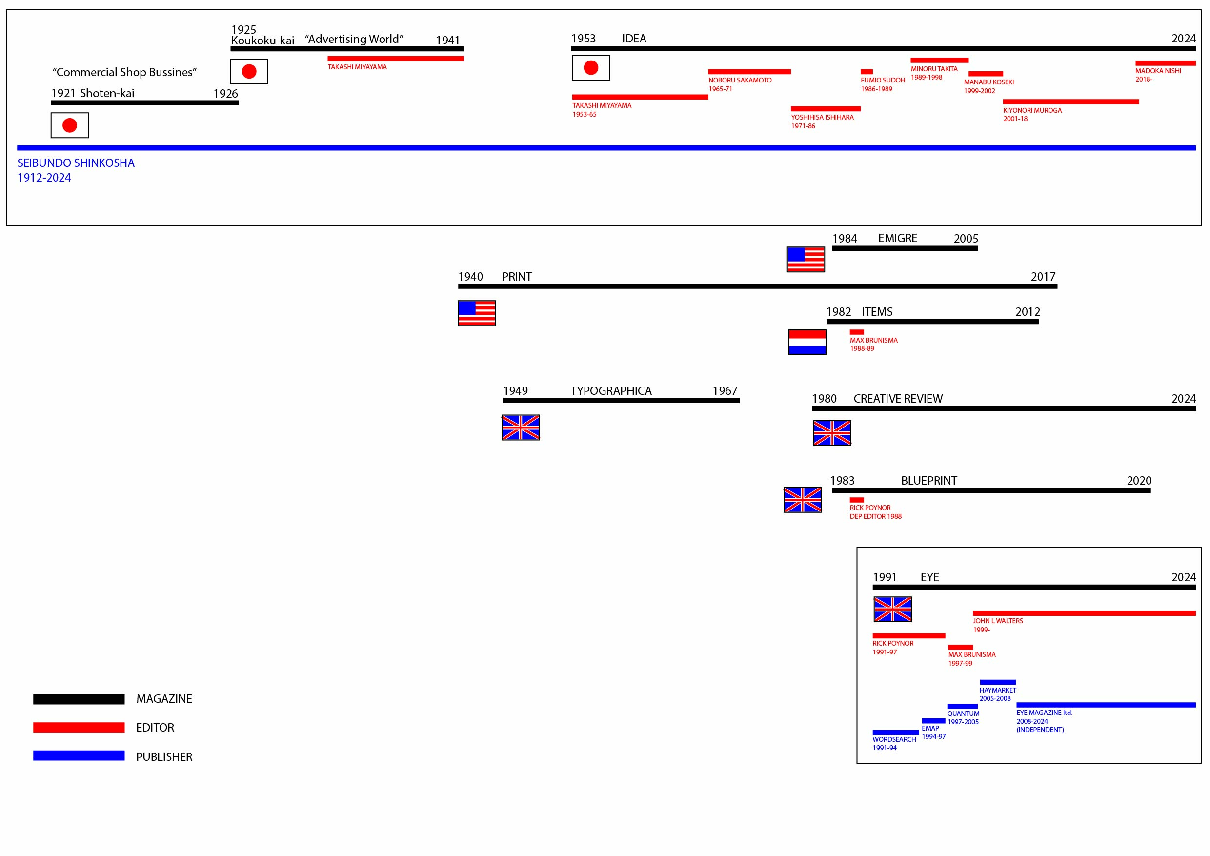
Figure 1 Timeline of magazines with publisher and editor changes for Eye and IDEA
History of Contemporary Graphic Design Magazine
This chapter will briefly explain parts of Figure 1, namely the contemporary magazines that came before IDEA and Eye. In Japan, 1921, Seibundo Shinkosha was publishing Commercial Shop Business, this morphed into Advertising World in 1925 which focused on international advertising but was discontinued during World War two. In 1953, post war, Seibundo Shinkosha began publishing IDEA as the spiritual successor to Advertising World, maintaining the international approach but with a new focus on graphic design as well as advertising.
In 1980s Britain, before Eye, Rick Poynor was surveying British design magazines when he realised there was ‘nothing in the established genre of international graphic design review’ (Heller, 1997). There were other countries with magazines that had an international approach to graphic design. America had PRINT from 1940 which initially included A Quarterly Journal of the Graphic Arts in its title. This was one of the first times western audiences were exposed to international design. Later in 1984 Émigré was formed which served ‘as a forum for typographical experimentation’ (Ambrose and Harris, 2006). Both magazines found success whilst focusing on design, albeit in unique ways or by covering different niches. In the Netherlands from 1982, Items covered more than just graphic design, but it is another example of a magazine that built a community by taking a journalistic approach to design.
Poynor noted that ‘this approach hadn’t been tried with any success in Britain since Typographica ceased publishing in 1967.’ (Heller, 1997). Typographica was one of the first magazines to bring international design to the British viewer. The way it presented the work within, making use of tight grids and typographic experimentation, also had an impact on the creation of Eye.
History of Eye
Eye was founded by Rick Poynor in 1991. Before Eye, Poynor was the deputy editor of Blueprint magazine and an author in his own right. In an interview with Steven Heller, Poynor reveals his policy when creating Eye ‘was to cover material that other magazines either weren’t covering, certainly not in Britain, or weren’t covering in sufficient depth.’ (Heller, 1997). Eye was a unique magazine from the start, highlighting international culture whilst introducing it to and critiquing it from a British society.
After 24 issues of editing Eye the role was handed over from Poynor to Max Brunisma, who before taking over the role, already had experience authoring his own books, teaching about design, and editing the Dutch magazine Items. He also wrote an article on Studio Dumbar for IDEA magazine in 1996 showing his interest in sharing prolific design work internationally (Figure 33 pg. 29). Brunisma believed that the creation of a magazine was about the relationship between writer and reader. In an article written by him he states, ‘A magazine isn’t just food for a targeted audience, it also feeds on the interests and loyalty of its readers’ (Brunisma, 2000). Eye was never thrown together; every design decision was made to engage the reader ‘in order to say something that will be read, viewed, appreciated and critiqued by an audience, which shares our interests.’ (Brunisma, 2000). Through the design process, decisions were made in order to produce a high level of engagement with the reader, not only to inform the reader but to challenge them too.
John L Walters was a deputy editor alongside Brunisma for multiple issues until he subsequently became editor for Issue 33. Walters has stayed the editor of Eye since then, even leading the magazine to become independently published. Before this independence, Eye cycled through publishing companies. Initially published by Wordsearch, a small publishing business, Eye was unsure of its survival from issue to issue until 1994 when EMAP publishing took over and Eye became financially stable. Quantum publishing was the next to take over in 1997 where they helped run Eye until Haymarket bought the rights in 2005. This relationship only lasted 3 years when, in 2008, Haymarket allowed John L Walters and art director Simon Esterton to purchase the rights to independently publish Eye. From the point of independence, Walters had full creative control and freedom in every aspect of the magazine, thus allowing Eye to become the purest form of what they wanted the magazine to achieve.
History of IDEA
Seibundo Shinkosha is the publishing company behind IDEA, founded in 1912, Seibundo published Kokoku-kai, which literally translates to “Advertising World”. It ran from 1925-1941 and started as a magazine ‘born out of the practical needs of the commercial world’ with the goal of ‘providing education and presenting practical methods that could have a direct effect on commerce’ (Takeuchi, 2007: 31-32). Takeuchi analysed the typographic advancements of “Advertising World” noting that there was a significant change when Takashi Miyayama became editor in chief as ‘Miyayama's skills established a firm direction for Advertising World.’ (Takeuchi, 2007: 31-32). In combination with a talented editor, ‘this magazine was created when cutting-edge designers of the time accepted modernist theory from the West. It played an important role not only as a source of information, but also as a medium that influenced the level of those who were involved in the practices of commerce, advertising, and promotion.’ (Takeuchi, 2007: 32-33). In 1941, during war time, the production of Advertising World shut down and it was only in 1953 that Takashi Miyayama suggested that the magazine should be brought back under the name ‘IDEA’. Miyayama created IDEA with undeniable typographical skills and experience of how influential a magazine can be within its targeted field.
IDEA has never had a change in publisher, meaning that the changes in the magazine can be attributed more to the editors and their responses to the surrounding culture. IDEA has changed editor seven times since the departure of Miyayama, each one building upon what had come before them. Due to the attitudes towards design in Japan, the editorial work of Noboru Sakamoto, Yoshihisa Ishihara, Fumio Sudoh and Minoru Takita, did not lead to significant changes in the magazine. They were creating during a time when design was not seen as a cultural asset. It is when Manabu Koseki took over that the shift in attitude is more visually prevalent. Koseki wanted IDEA to become more of a designed object to be collected and due to technological advancements, it was easier for anyone to create artwork. This changed the attitude towards design in Japan which allowed for, and encouraged, these alterations. After Koseki, Kiyonori Muroga took over and this is arguably when IDEA underwent the most visual development. Muroga understood the importance of what had come before whilst also being in tune with what the culture needed to see, and he used IDEA to further his design philosophy for Japanese graphic design. Muroga handed the baton to Madoka Nishi after he believed he had done what he could to lead the next generation of designers. Nishi continued his work, maintaining a similar philosophy whilst being a part of this new generation of designers.
Visual Grammar
To understand why each magazine changes, we must understand the influences behind the magazine. A change in publisher or editor is a change in the way that the magazine is constructed, as each company or person will have a different ethos and approach to creating it. Sometimes they might want to put their own stamp on it, or they might have some preferences when it comes to the content, look and feel of the magazine. ‘Even when art directors and editors junk the rules and reinvent the form, there are certain elements that inform the way a magazine is created, perpetuated and refreshed over time.’ (Walters, 2018). This supports the notion that through the analysis of the elements, regardless of how much is changed, details about why the magazine has changed can be inferred. Especially when combined with evidence from the editors about their own approach to designing and what they believed the purpose of the magazine to be.
In order to fully understand the way in which the magazines have developed and the way they present themselves due to their different cultural contexts, we have to look at the advancements of the visual grammar of both. Kress and van Leeuwen’s description is as follows: ‘Grammar of the visual describes how depicted elements… combine in visual ‘statements’ of greater or lesser complexity and extension. To generalize, we might say that if the traditional approach has focused on depiction, our focus is on arrangement, on composition’ (Kress and van Leeuwen, 2020). This approach on how visual grammar is used on the page dictates what and how information is communicated to the reader. Combining this approach with secondary research will educate us on how the graphical elements change in order to change what is communicated to the audience.
In this essay the visual grammar of both magazines will be analysed through the changes in composition, colour, typography and imagery. Every component has its own significance, according to Nørgaard, typography and ‘the visual aspect of printed verbal language is meaning-making in its own right’ (Nørgaard, 2009). The text used is not purely used as text but also an essential visual in building the foundation of how the page looks and reads. Colour is an essential tool as ‘adding colour to documents can increase the reader’s attention span by more than 80%’ (Kress, G. and Van Leeuwen, T, 2002). The use of colour and imagery in an article can draw the viewer in and immerse them more into the information being presented.
When analysing these magazines, the contents page will be one focus as ‘a good contents page is an over-achiever and a multi-tasker. It is a navigation tool, a sales pitch, and a brand statement all in one. Just how hard it needs to work depends on the nature of the title.’ (Porter, 2018). The evolution of the contents page will be a reflection of the magazine; it is more than likely one of the first pages a viewer will see, it is how the magazine has chosen to introduce the work contained within. This one page has to capture the essence of the magazine in order to engage the viewer to read further.
Christian Leborg outlines how ‘Visual objects in a composition relate to the viewer, the format, and other elements within the composition’ (Leborg, 2006). Every element is interlinked and reacts with one another, specifically composed to build upon the audiences’ preconceptions in order to communicate a visual message. This means every element must be assessed in the analysis, as leaving out components will result in an incomplete representation of the intended message. Leborg also expresses that a visual experience has to occur in a format: ‘If we could not relate visual signals to a format – in other words, to a surface, a space, or a limitation in time – our brain would not be able to interpret any of these impressions’ (Leborg, 2006). Within the context of this essay the format is the pages of the magazine, it is then the elements and all of their effects working in tandem to create a visual statement that the reader interprets to intake information. Max Brunisma characterises successful editorial design as someone who can ‘understand the content and the audience and bring the two together.’ (Heller, 2000). By analysing the choices that the editors have made we can hope to grow an understanding of the audience and thus the culture itself.
Changes in graphical elements occur when the editor wants to depict information in a new way. The editor curates a particular experience for the reader. John L Walters understands his role and exclaims that editors are not what draws people to the magazine, ‘we bring our experience and knowledge to a subject, but a magazine is for its readers – whom we presume to want the best words and the most appropriate pictures for each feature or review. Magazine-making is not a form of self-expression. Having said that, there will always be parts of one’s personality that leak through.’ (Golub, 2020). This quote emphasises that Walters understands the importance of his influence as editor but also the importance of the reader. During the analysis it is imperative to remember that although the editor may incorporate some of their personality into their decisions, their main goal is to always serve the reader. By analysing the changes made, we can try to recognise why they believed changes needed to be made to create the best experience for the current culture.
Cleveland recognises that ‘the interplay of these elements builds up meanings within different cultures. The same image can often produce different meanings within different cultures.’ (Cleveland, 2005). During the evaluation of these magazines, if there are similarities between the two then it cannot be assumed that the resulting effect is the same within both cultures. Design changes that occur could be due to the development of the attitude towards design in each respective culture and so during a comparison the surrounding culture and society has to be accounted for.
Analysis of Eye
When asked how Poynor would distinguish Eye from other graphic design magazines he replied, ‘apart from studying all of them very closely to see what they did well or badly, my approach was to say, “Let’s create a graphic design magazine which is as good as the best art magazine we know and takes very seriously the standards of mainstream journalism.”’ (Heller, 1997). This is evident when reading Eye as you can tell every element has been assembled with knowledge of how they will interact with each other and therefore influence the reader. Poynor credits Herbert Spencer’s magazine ‘Typographica’, published from 1949-67 (Fig. 2), as the driving inspiration in the creation of Eye. He notes how ‘Spencer assembled lavishly illustrated articles covering many pages, especially in the magazine’s second series. His twice-yearly journal introduced important historical subjects alongside features about significant new design.’ (Poynor, 2020). This inspiration is clear from the start as Poynor set out to essentially do what Typographica had already achieved; gathering international design that he believed was significant enough that it needed to be highlighted and then archived in a way that put ‘emphasis firmly on graphic design as a form of cultural practice’ (Poynor, 2020, p. 127). Emphasising graphic design’s place within the culture paired with a high standard of journalism was necessary in order to make sure graphic design was respected and understood within the culture.
Figure 2 Herbert, Spencer Typographica
Issues 2 and 11 were edited by Poynor and published by Wordsearch. In issue 2 the contents page (Fig. 3) is spread across 2 pages and contains imagery relevant to articles found within, this was when Eye was still a trilingual publication.
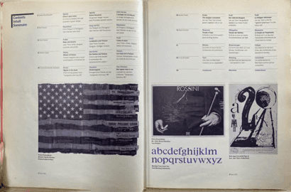
Figure 3 Eye Issue 2 Contents Page
The use of imagery here could be attributed to creating an easier first impression for any reader no matter the nationality. After Issue 7 Eye became an English only publication. This was due in large part to the number of American writers who were writing about graphic design at a high level, which led to Eye’s content having an Anglo-European focus.
In Issue 11 you can see the contents page (Fig. 4) has been reduced to just one page with no imagery, allowing for more space within the magazine for articles.
Figure 4 Eye Issue 11 Contents
‘With Rick Poynor, Eye was a critical channel through which these designers were assessed and analysed seriously for the first time’ (Brunisma, 2000). Everything about this layout was created to make the reader take the information and the designer seriously. In issues 2, 11 and 22 the ‘Reputations’ spreads (Fig. 5 and Fig. 6, 7 pg.18) change only slightly, remaining consistent with three columns of text for the actual interview, a powerful hero image and the designer’s name in bold. ‘The ‘Reputations’ interviews - Q&As were unusual in design journalism then, and Blueprint always avoided them - were reserved for leading lights who could talk illuminatingly about their thinking and work.’ (Poynor, 2020). The consistency could be attributed to the confidence Poynor had in this section especially since it was not being done at the time. He believed these designers to be leaders of the time and the respect he had for them is inferred through the space he gave them and the care he put into their pages. By presenting the designers in the best possible format, this is contributing to the case of making graphic design a culturally respected and documented art.
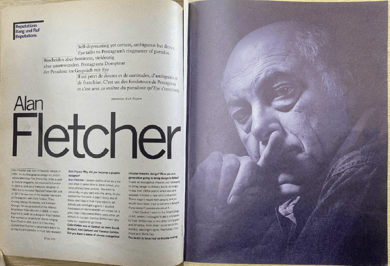
Figure 5 Eye Issue 2 ‘Reputations’
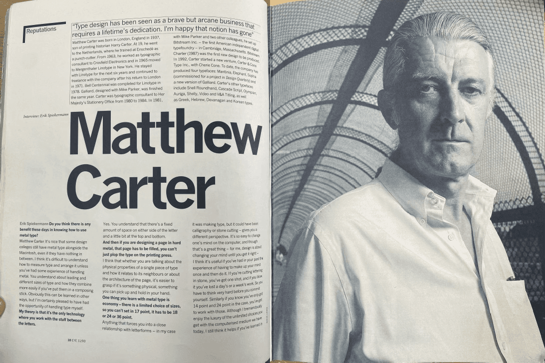
Figure 6 Eye Issue 11 ‘Reputations’
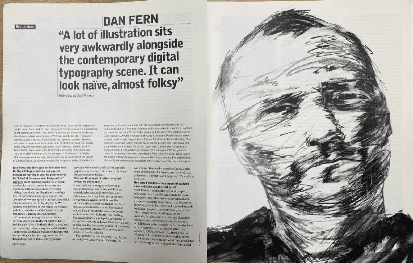
Figure 7 Eye Issue 22 ‘Reputations’
When Max Brunisma took over as editor with issue 25, the ‘Reputations’ segment remained largely the same (Fig. 8). Instead, it was within the editorial (Fig. 9, pg.19) that Brunisma experimented with the form and type that had come before. In his first editorial page he addresses the readers, informing them: ‘It is now up to me to ask what Eye’s role and ambitions are with respect to the discipline of graphic design and it’s social and cultural contexts.’ (Brunisma, 1999).
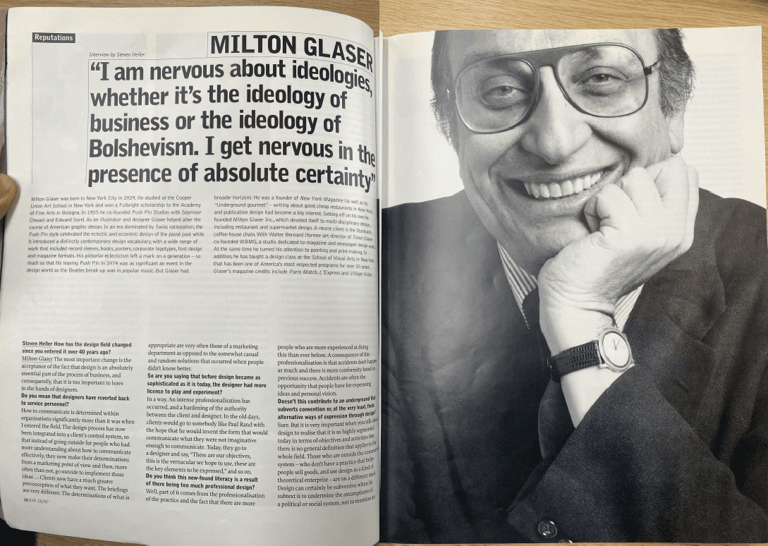
Figure 8 Eye Issue 25 ‘Reputations’
Figure 9 Eye Issue 25 ‘Editorial’
Alongside this message he makes his first impression by using an irregular array of fonts with differing font sizes and textboxes that protrude out and in from a central column. He maintained some of this irregularity in his last editorial page in issue 32 (Fig. 10), choosing to bring character to each article by pairing a pulled quote with a typeface. Brunisma’s design decisions were also rooted in the reputation of graphic design within the culture. He kept ‘Reputations’ the same, as the respect towards designers was maintained, but this type of experimentation that he played around with was used to show that graphic design could break the regular form whilst still being held in a high regard.
Figure 10 Eye Issue 32 ‘Editorial’
John Walters joined a podcast with Jarrett Fuller where he spoke about his journey from musician to editor of Eye. He agrees with Fuller’s suggestion that Eye’s editorial strategy has stayed the same stating ‘The editorial shape of Eye was laid down very early by Rick Poynor and Steven Coates’ (Scratching the Surface, 2018) going on to say that the ‘seriousness was there right from issue one of eye, where you have contemporary work, reviews, in depth criticism, throwing a light on some things that are not of the moment’ (Scratching the
Surface, 2018). Walters clearly respects the history of Eye and the editors that came before him, he maintains the earnestness that has always been there when covering graphic design. Walters then sheds some light on how he achieves this revealing that, ‘We have a very strict grid, there’s a certain way we do things, a certain structure that makes it look like the magazine.’ (Scratching the Surface, 2018). For maximum consistency there is a grid that makes Eye subtly recognisable, the form may be adjusted between issues or articles, but this foundation grid is what structurally makes up the DNA of Eye and without this, it would not feel like the same magazine.
When looking at the first issue Walters edited it is clear he was continuing the work of those before him, the ‘Reputations’ spread (Fig. 12) still maintains its consistency and the contents page (Fig. 11) bears a resemblance to Poynor’s earlier issues. Only as time went on did Walters start to develop the magazine in his own direction. His contents pages became bursts of colour the moment a reader opened the page, each issue donning a new brightly saturated page with a minimal amount of text in a contrasting colour. His editorial would always be found on the opposite side occupying the entire page with one column of text. (Figs. 13,14 pg.21)
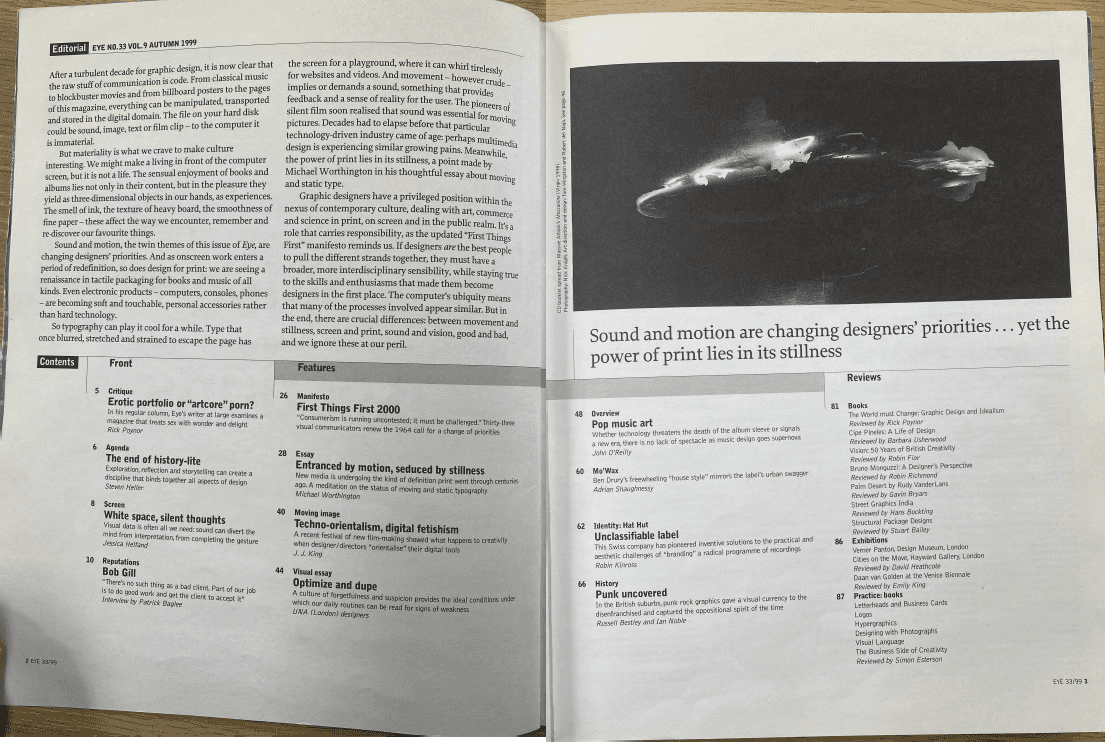
Figure 11 Eye Issue 33 ‘Editorial and Contents’
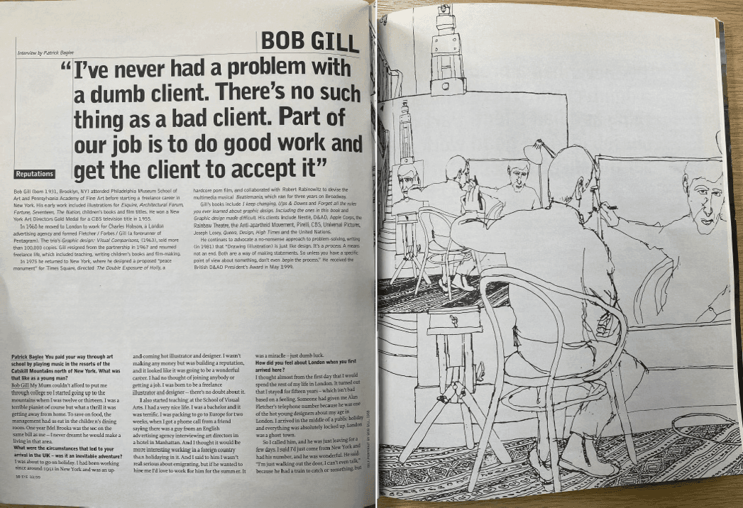
Figure 12 Eye Issue 33 ‘Reputations
Figure 13 Eye Issue 55 ‘Contents and Editorial’
Figure 14 Eye Issue 56 ‘Contents and Editorial’
At this point in time Eye had become an established and respected magazine in the world of international graphic design. This meant that there could be more experimentation within the design of the spreads without a fear of alienating the readership. With every issue Walters claimed: ‘We did our best to make the magazine we thought our readers wanted to read. We felt there was a community around Eye, that there was an intense interest around Eye, around graphic design.’ (Leslie, 2016). This assurance that there is interest in graphic design and a community around Eye meant that there was an expectation of high-quality content, both visual and textual. The experimentation and variation within designs is evidence of Eye evolving in order to keep its audience engaged.
In issue 56 the article on Ishihara’s work (Fig. 15) still maintains a strict grid. It is the placement of the imagery, headline, captions and the use of white space creating a cohesive visual delight that would be uncommon in other mainstream journalistic articles but that makes perfect sense for Eye. In Issue 62 the double page spread, “Prints that live up to the Hype”, (Fig. 16, pg.22) not only verbally informs the reader of the advancements in printing technology, but the pages represent them as well. The slick black print with a bold yellow headline and crisp columns of pure white text. It is a spread that works simultaneously as an article and an advert for HP.
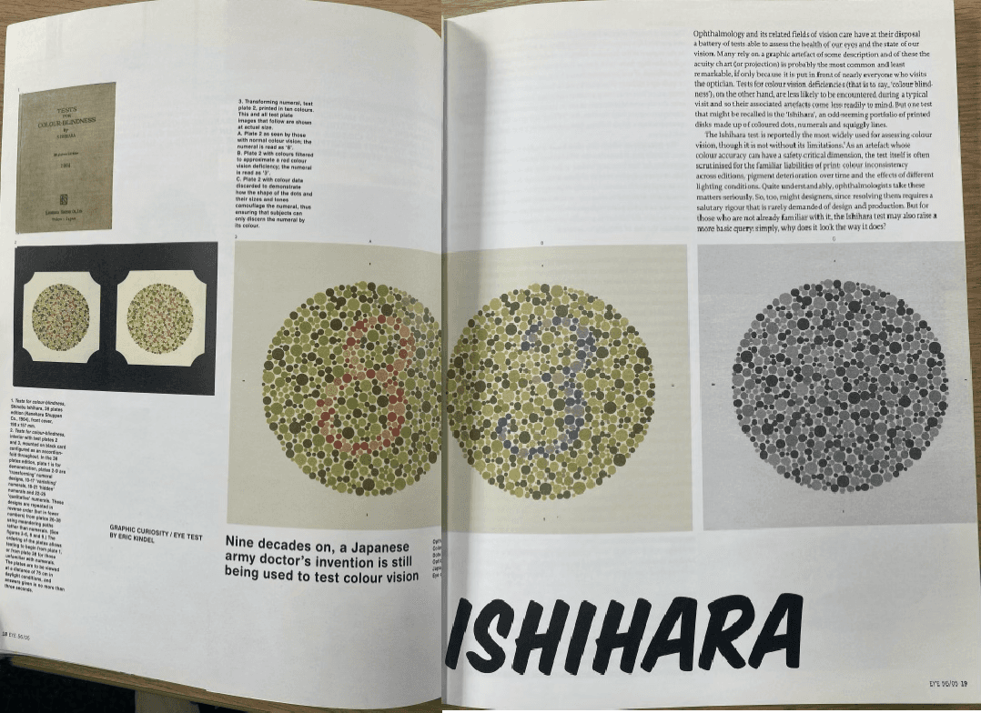
Figure 15 Eye Issue 56 ‘Ishihara’
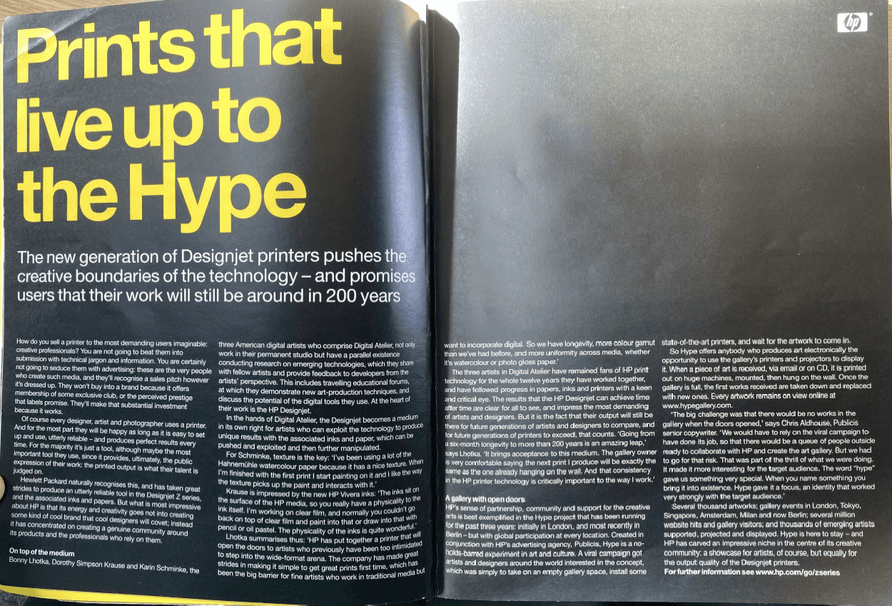
Figure 16 Eye Issue 62 ‘Prints that live up to the Hype’
Walters engages in conversation about how he ‘did go through a number of publishers, all of whom struggled to make a success of it. It always seemed to me that they weren’t quite sure what to make of Eye.’ (Leslie, 2016). As well as the publisher being unsure of what Eye is there were risks to being part of a larger company including ‘reducing the print quality to save money, changing the distribution methods or using marketing methods that are unsuitable for your audience’ (Hogarth, 2019). This contributed to John Walters and Simon Esterton taking the risk to make Eye independently, they knew what Eye was about and who it was for. Making Eye independent meant that full creative control was now in the hands of the designers, it was also during this time there were ‘huge technological advances in layout software, photography, scanning, pre-press (“repro”) and printing. The colour, clarity of image, and sharpness of type we get with contemporary printing is so good compared to what most mags were like decades ago’ (Del Val, 2020). These advancements, combined with the independence, brought Eye to an even greater editorial standard. The ‘Reputations’ interviews from this era of independence showcase this improvement in quality, but they still bare resemblance in some ways to past designs, they are still built to maintain the respect previously earnt. What changed is that these new spreads had the ability to experiment with colour, form and sharper images that capture the essence of the designer in greater detail. This immerses the viewer more into the designer’s world, increasing understanding, which in turn leads to a higher level of respect for graphic design as a medium.
In Issue 78’s ‘Reputations’ interview (Fig. 17) the name is still used as the headline, but the pull quote is composed using a complementary typeface, the white space is used effectively to keep your eyes in the centre of the page and then move up. In Issues 78, 86, 90 and 105 (Figs. 17, 18, 19, 21) the article text does not appear until the next page over, instead the name and pull quote are used in tandem with the image to draw you in. The spread is designed to give you a glimpse of their personality, you feel it through the image and understand a part of them through the quote.
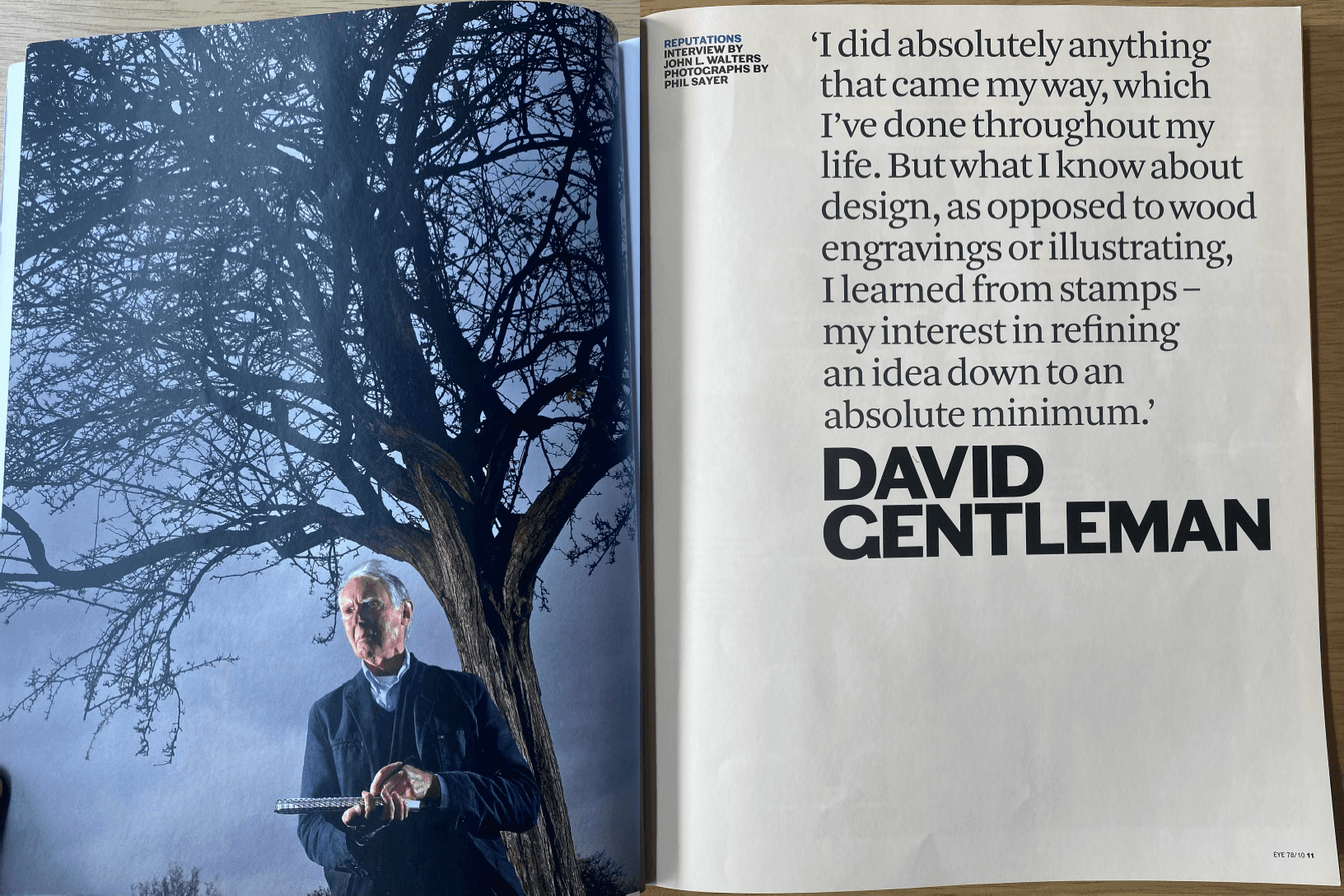
Figure 17 Eye Issue 78 ‘Reputations’
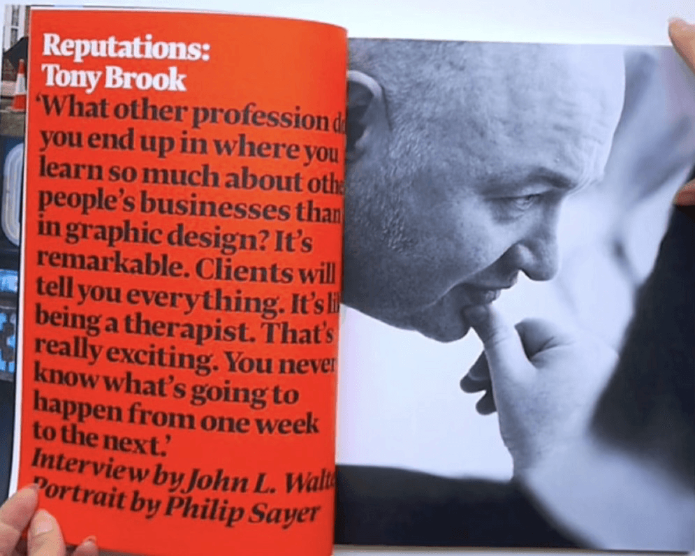
Figure 18 Eye Issue 86 ‘Reputations’
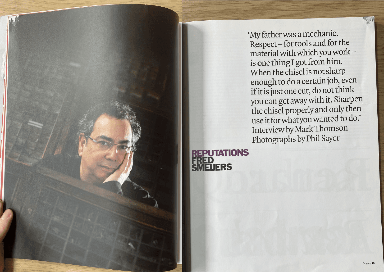
Figure 19 Eye Issue 90 ‘Reputations’
Although these issues are producing the same effect there is still variation in their approaches. In issue 86 (Fig. 18) the colour is found not on the image, but on the side of the name and quote. This creates the same balanced design as previous issues but with a new spin. The glossy red page adorning a full block of text where the headline is the same point size as the pull quote, but the hierarchy is achieved through the use of white and black text. In issue 100 (Fig. 20), the ‘Reputations’ article has a closer resemblance to those early interviews, perhaps due to issue 100 being a celebration of Eye’s history with this visual call back to its beginnings.
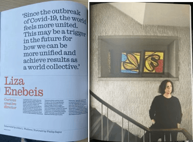
Figure 20 Eye Issue 100 ‘Reputations’
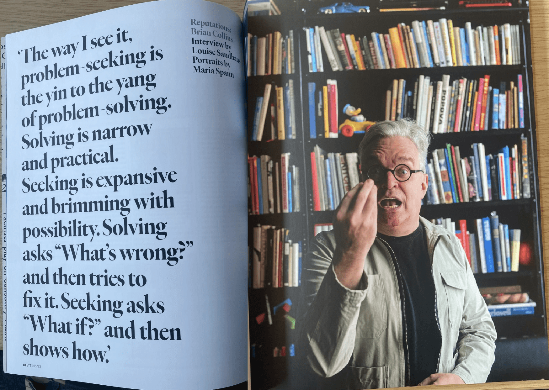
Figure 21 Eye Issue 105 ‘Reputations’
Analysis of IDEA
Under the editorial leadership of Takashi Miyayama when IDEA was first published, it was a magazine that, ‘was deeply connected to the hierarchy of the graphic masters’ community. The magazine would publish the best protagonists and outcomes of their competition.’ (Offermanns, 2016). The mentality of only documenting the best work around the world meant that it was putting itself adjacent to these design leaders. In order to be respected by these designers the content had to be arranged in a way that inferred that they understood the importance of design themselves. In Issue 68, one of Miyayama’s final issues, you can see on the contents page (Fig. 22) that the information is all aligned to the right. In Japan one of the more common forms of reading is from right to left, even though some of this text is in English the Japanese principle is still applied. On the contents page there is a strict grid and a strong utilisation of white space, all the necessary information is supplied within the right column of the page, but nothing feels cramped, there is space for every element to breathe. On the spread covering Jerry Braude (Fig. 23), the elements are arranged on a 3-column grid, the headline and text are in a sans serif font, they are in a relatively small point size but due to the use of white space around it, the hierarchy of the pages remains intact.
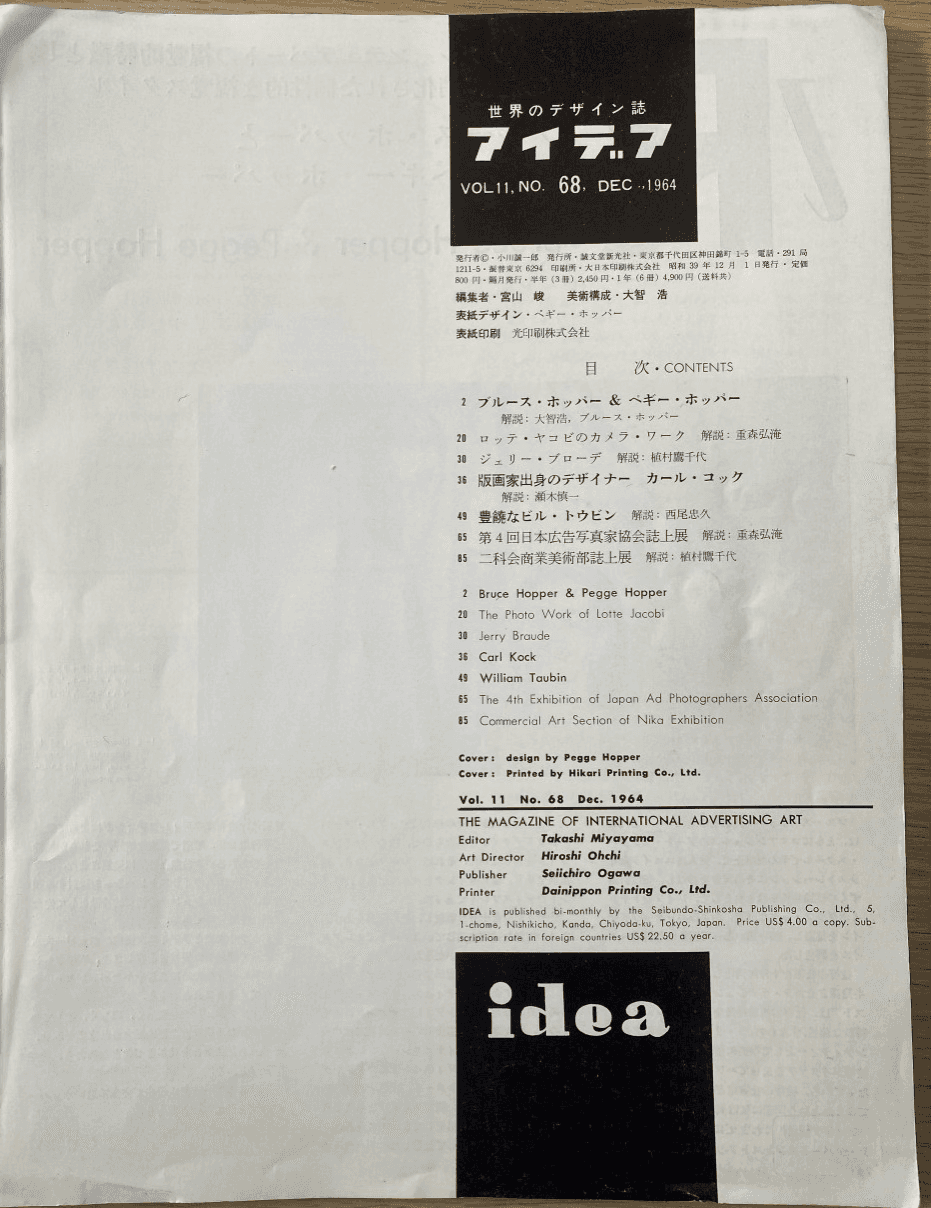
Figure 22 IDEA Issue 68 ‘Contents’
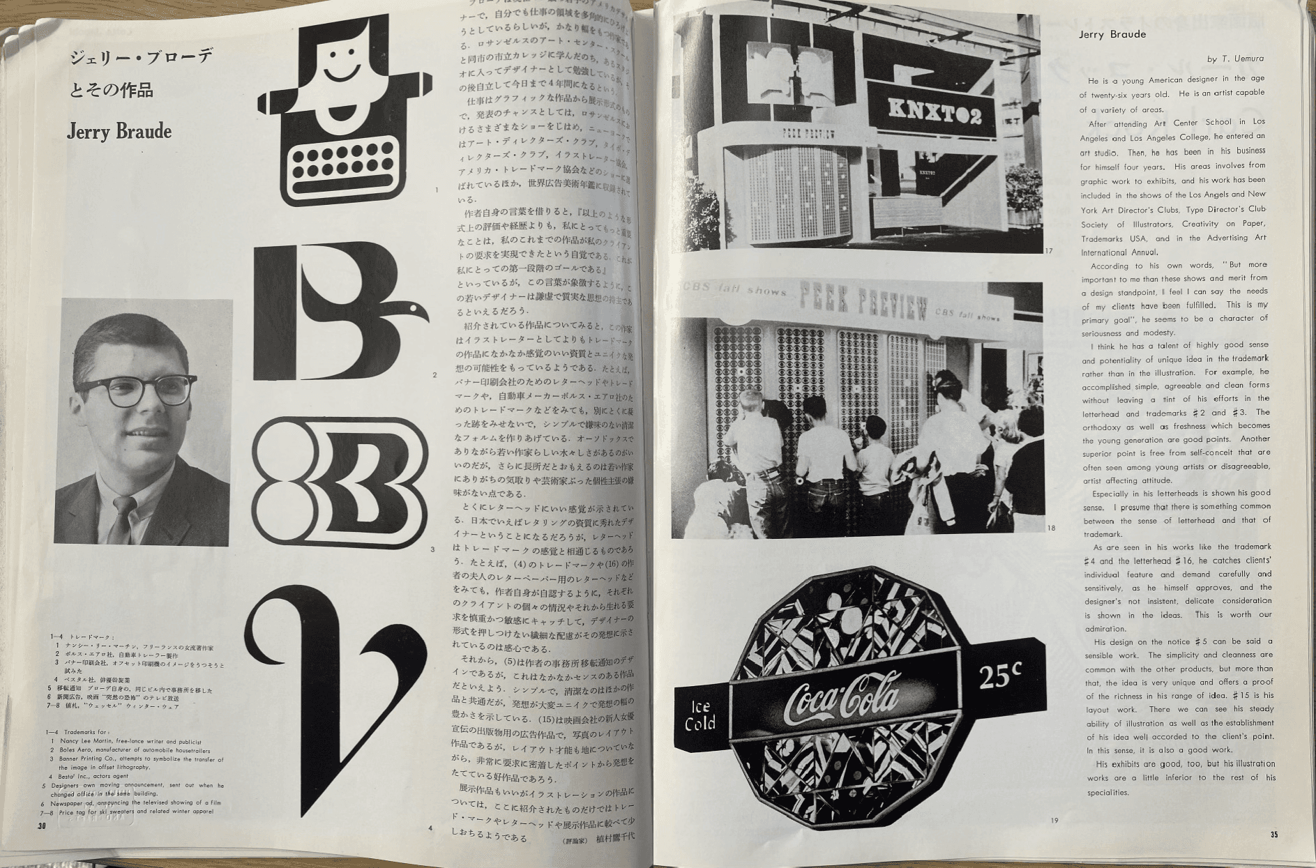
Figure 23 IDEA Issue 68 ‘Jerry Braude’
In Noboru Sakamoto’s first issue, 70 (Fig. 24), he repeats the same contents page used by Miyayama. The spread on Peter Gee (Fig. 25) uses a larger point size for the headline and there are less elements found on the page. By using minimal text and arranging the imagery further apart it draws more attention to the work of Gee. Sakamoto has opted for more of a visual introduction to the artist, allowing the viewer to read his name and then be introduced to a selection of his works, with more textual information found on the next page.
Figure 24 IDEA Issue 70 ‘Contents’
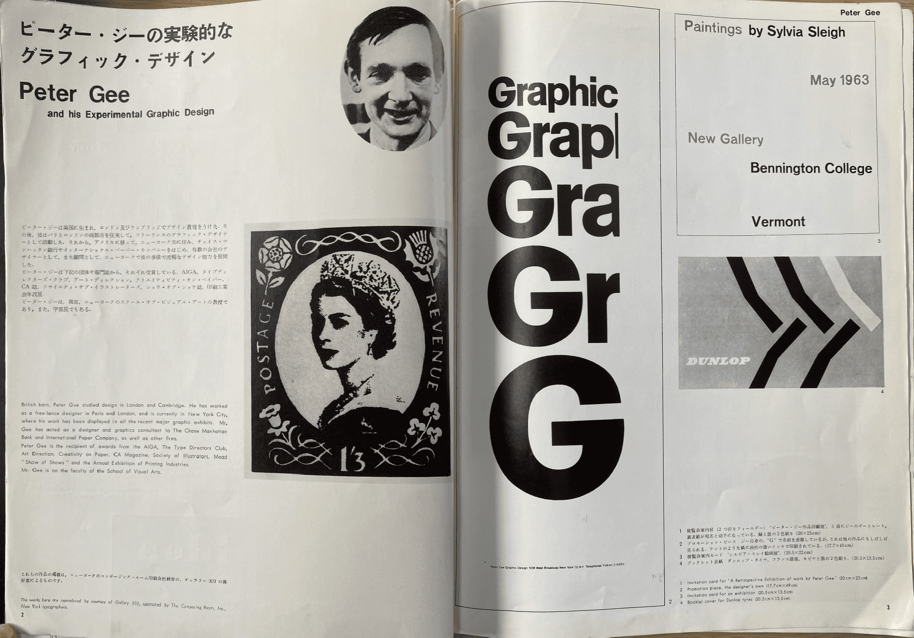
Figure 25 IDEA Issue 70 ‘Peter Gee’
From issues 91 to 107 (Fig. 26, 27), the contents pages have been expanded to fill more of the page, separating the articles found within from the publishing and editor information. What remains the same is that both IDEA logos are the main focal point.
Figure 26 IDEA Issue 91 ‘Contents’
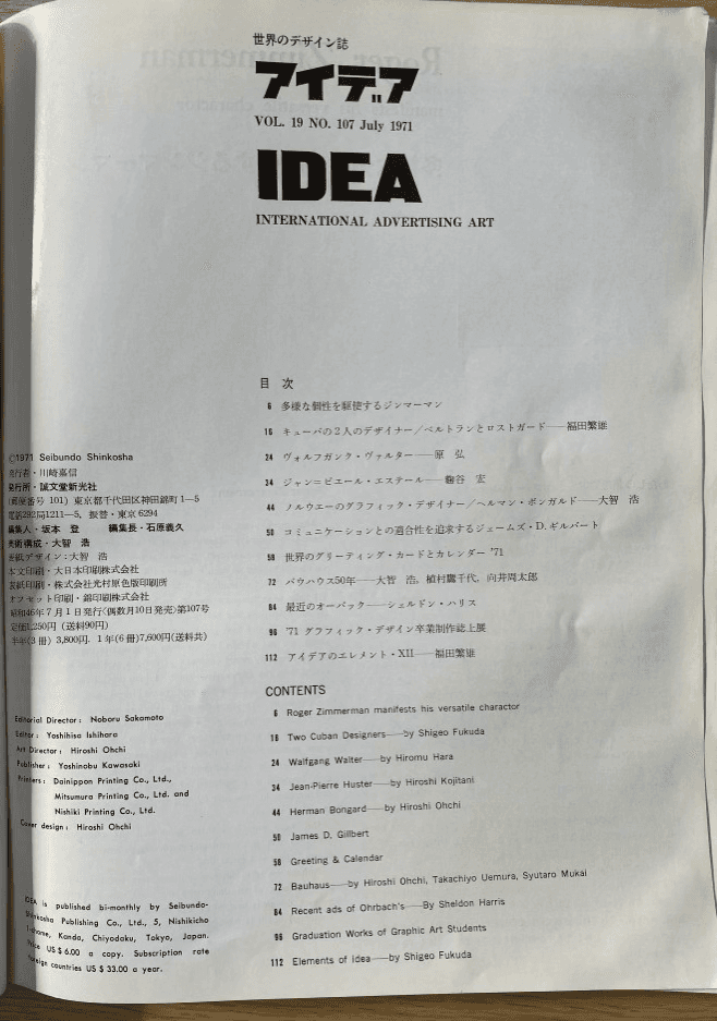
Figure 27 IDEA Issue 107 ‘Contents’
In issue 106, the spread on the International Typeface Corporation (Fig. 28), again makes use of white space to both guide the viewers eye and to bring more attention to the photo found at the bottom. On the following page, the Japanese and English text are both split into three column grids, divided by a typographic example that encapsulates the focus of the article.
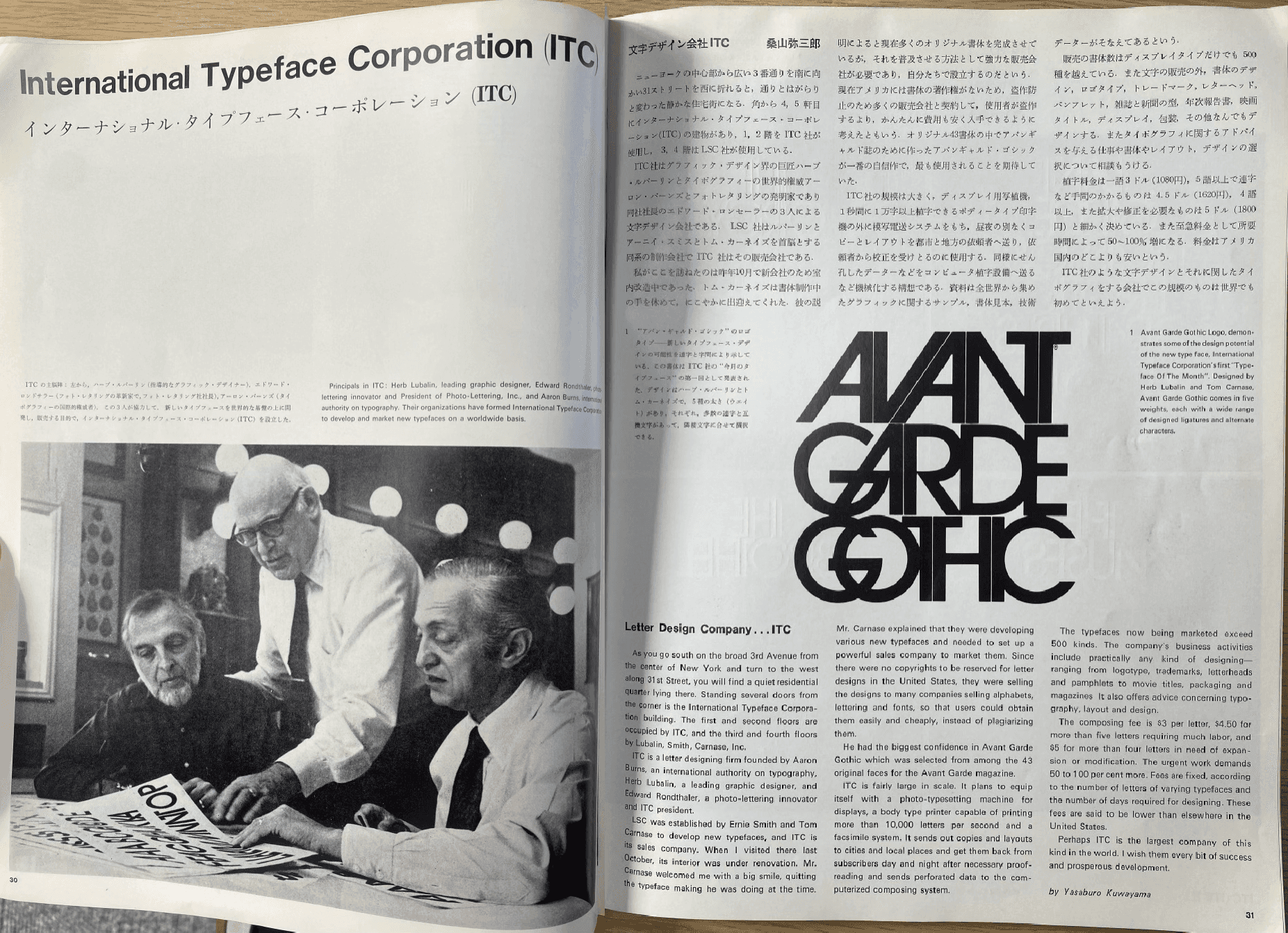
Figure 28 IDEA Issue 106 ‘International Typeface
In issue 107, in the Bauhaus article (Fig. 29), the textual information is all located on one page with any corresponding images having their own page to stand out, the only text being small captions.
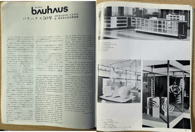
Figure 29 IDEA Issue 107 ‘Bauhaus’
When Yoshihisa Ishihara took over the magazine in 1971, the editorial structure remained largely the same, articles were arranged into three columns with imagery incorporated within to illustrate the information being presented. It is during Ishihara’s run as editor that colour became a larger feature within the magazine. IDEA had the financial backing and trust to do this as their publisher had been around since 1912 and had supported them in every issue. This use of colour elevates the articles to an even greater standard. However, it was not yet feasible to have colour on every page and so the pages with colour on were deliberately selected as the pages to bring about the greatest impact on the reader. In issue 190, the double page spread on Kiyohsi Awazu’s Art Exhibition (Fig. 31 pg. 27) not only employs colour to bring this exhibition to life but also positions the smaller images at a slight angle. This visual trick is used to ensure these smaller images do not get lost within the bright colours, but their irregularity draws your eye.
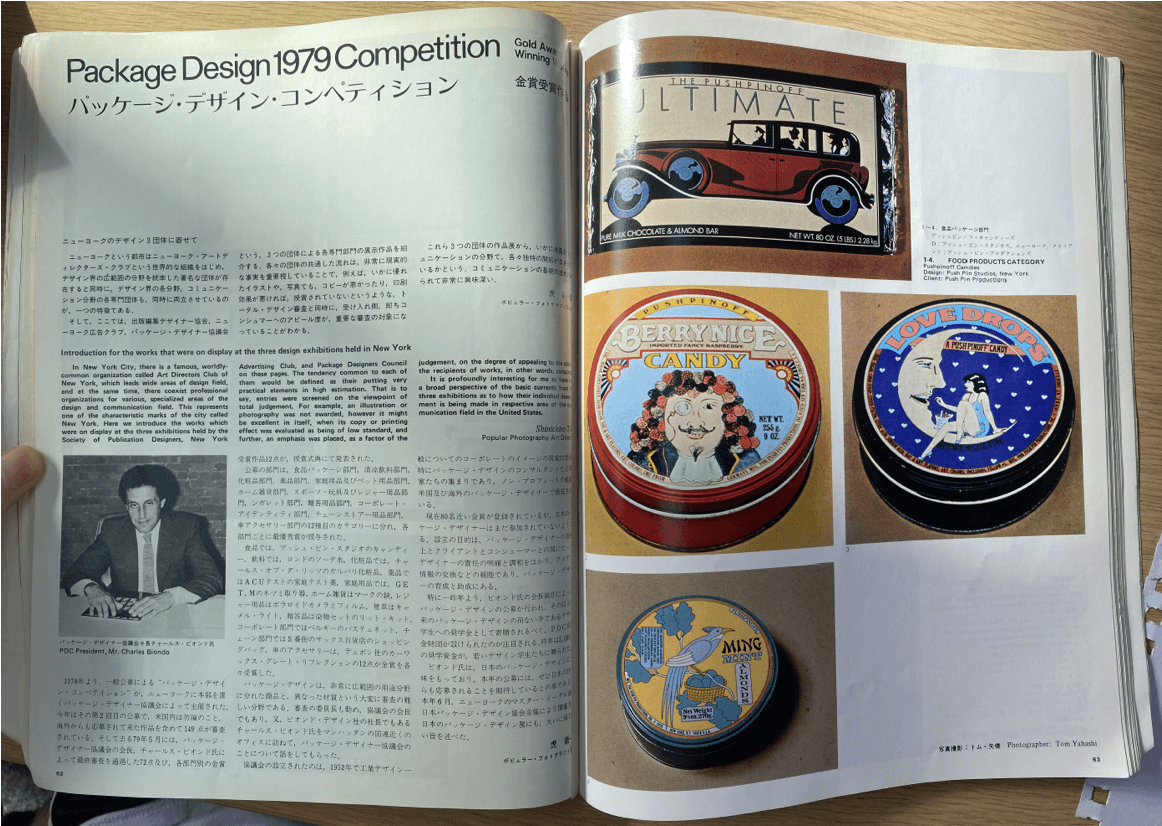
Figure 30 IDEA Issue 159 ‘Package Design Competition’
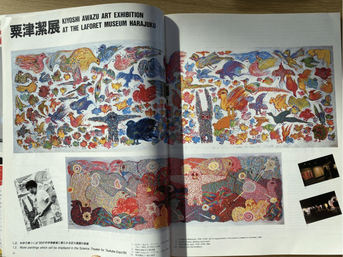
Figure 31 IDEA Issue 190 ‘Kiyoshi Awazu Art Exhibition’
In an interview with Kiyonori Muroga he discusses what IDEA was like in the past stating, ‘the magazine followed a basic editorial and production structure. There were neither editorial nor printing specialties applied’ (Offermanns, 2016). This is evident when you look at the designs of Miyayama (Fig. 23), Sakamoto (Fig. 25), Ishihara (Fig. 30) and Sudoh (Fig. 32).
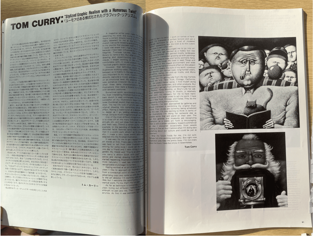
Figure 32 IDEA Issue 195 ‘Tom Curry’
Although there are slight elemental changes in the magazine, the format and presentation remain largely the same. Every page is balanced and well-designed, but it is almost as if there is no desire to take any risks with the presentation. The formatting is perfect, but once a magazine has done this for so long without experimentation, it may be fair to call the design stale. In no way is it undesirable, but with little evolution to the visual grammar of the magazine it ran the risk of becoming outdated. This could be attributed to the problem that Shinichi Segi discusses in IDEA issue 200 on the role of design within Japanese culture at the time. He states that design ‘must work toward the establishment of its cultural worth and recognition in our economically oriented society. Essentially, today’s society recognizes the need and effectiveness of design as a cultural asset, but cultural assets, by their nature, are not necessarily directly and fully usable to this society. Culture is completely powerless in areas where worth needs to be instantaneously translatable into monetary values.’ (Segi, 1987, p. 148). When being created in a society that recognised design as a cultural asset but did not see its financial value, experimentation within the magazine may not have been welcomed by Japanese society as they had a fixed view on what design should be. In order to change society’s attitude towards design, the magazine had to evolve to test and subsequently break the boundaries that were limiting opinions on design lacking financial value.
Minoru Takita was the editor after Fumio Sudoh, and the one bringing the magazine into the new millennium. At this time Muroga was just senior editor but he notes the shift in attitude. He expresses that at this time ‘The former chief put more stress on the magazine as an object.’ (Offermanns, 2016). This meant that IDEA was no longer made just to inform and document international design work, but it was also being made to be collected and taken in as a piece of design itself.
You can see this development over the course of Takita’s tenure as editor, (Figure 33, 34, 35) his initial issues followed that structure that came before but as you reach Issue 278, (Fig. 36) you can see these advancements in the feel of each page. The spread on David Carson not only informs you of Carson’s work but emulates it too, making the spread both informative textually and visually.
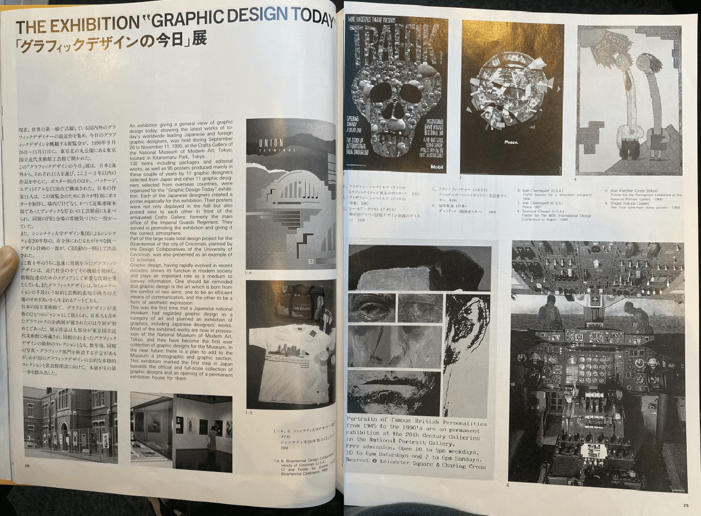
Figure 33 IDEA Issue 224 ‘Graphic Design Today’
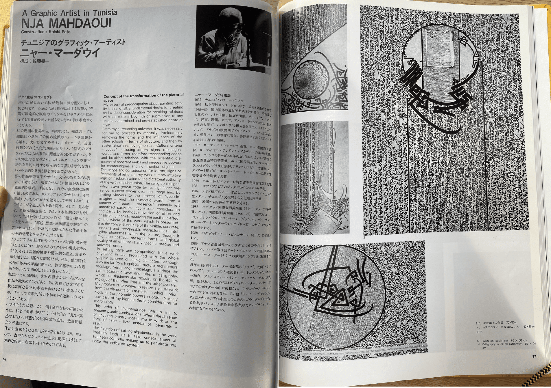
Figure 34 IDEA Issue 229 ‘Nja Mahdaoui’
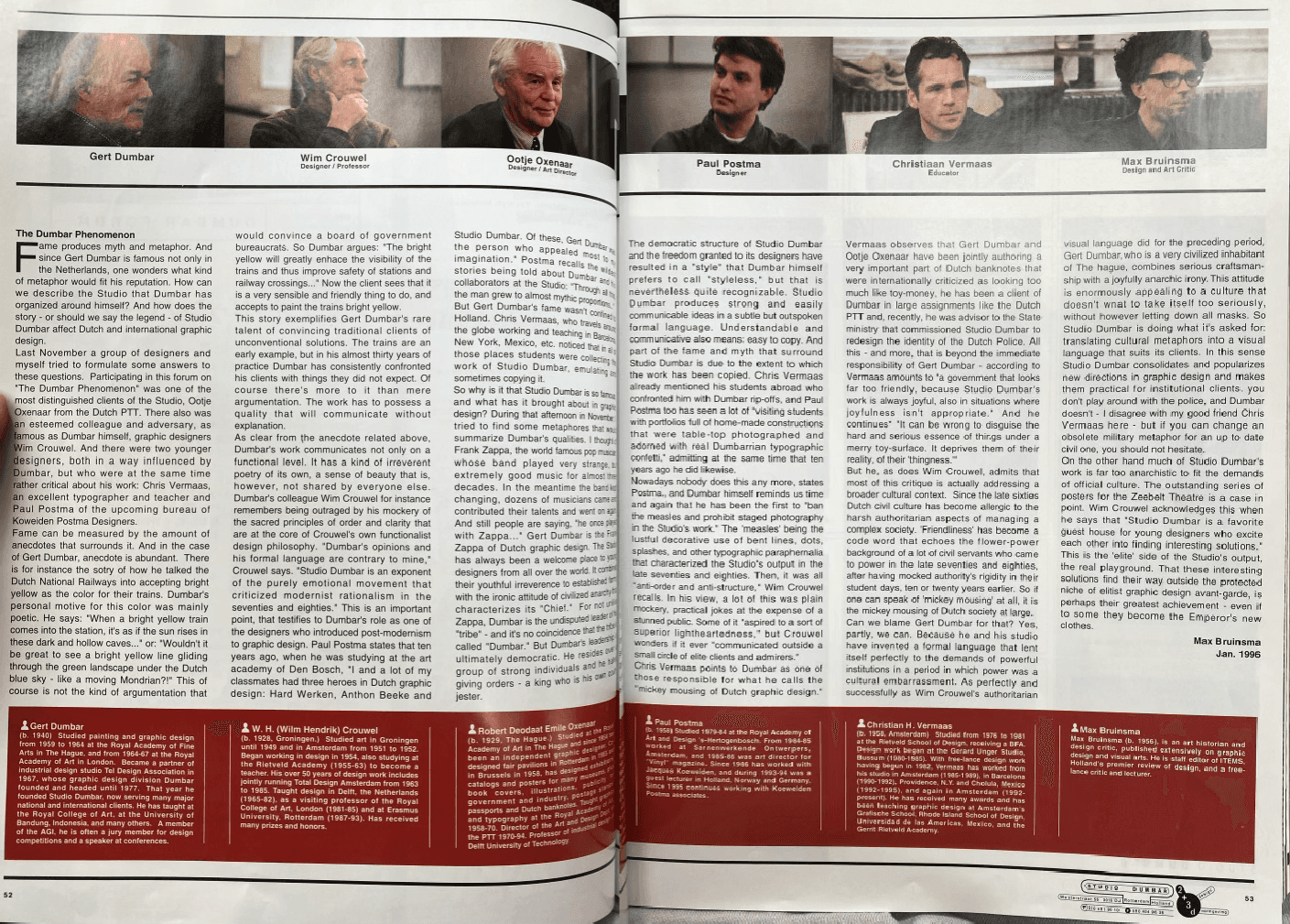
Figure 35 IDEA Issue 255 ‘Studio Dumbar’
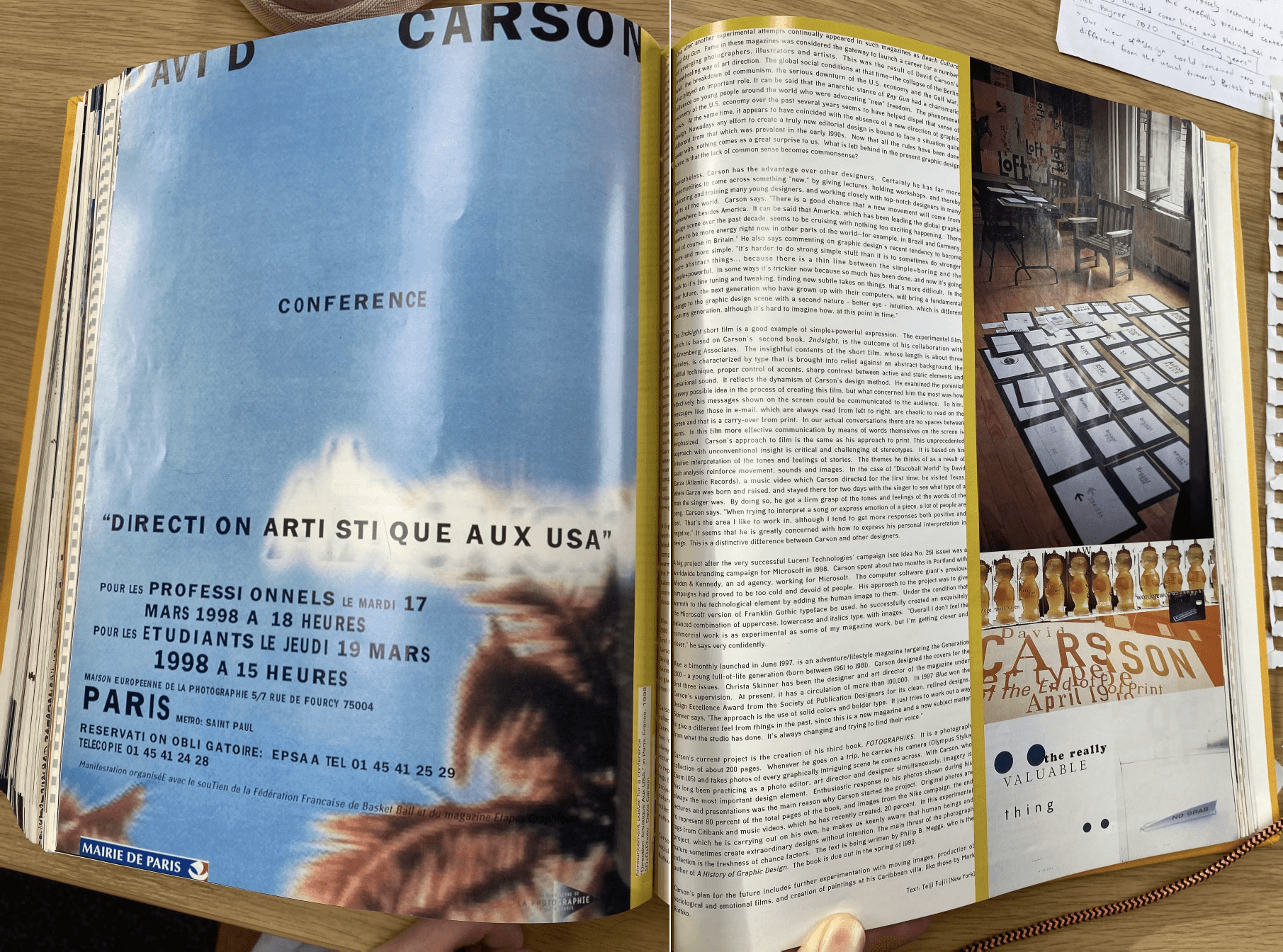
Figure 36 IDEA Issue 278 ‘David Carson’
‘In colloquial Japanese, the loanword "dezain" (design) is used regularly in lieu of the two indigenous terms for the design process: "koan" (design conceptualization) and "zuan" (design actualization).’…. Kiyonori Muroga ‘has been obsessed with exploring the implications of these two branches of design thinking since becoming an editor at IDEA’ however he also expresses concern saying: ... ‘“I find it fundamental to tread carefully regarding this," Muroga says. "It is not self-evident in Japanese language, and thus the concept of what design actually is, is constantly changing.’ (Lynam, 2015). In order to truly reflect the culture around it, Japanese design should not be confined to a singular process, it must be fluid in the way it changes and evolves. Muroga incorporates this philosophy into his design of IDEA. The design should always be changing to be a better reflection of what is around it, or if not a reflection, it should be a goal to strive for. Muroga uses IDEA as the vehicle to express what he thinks Japanese design should become.
When Muroga became editor, he was unhappy with the routine that the magazine had become stuck in, he disclosed that when he joined the office, ‘I tried to push for more of a punk, rebel spirit. I tried to free the magazine from this competitive hierarchy related to the graphic industry, and I pushed for creating a platform for discourse.’ (Offermanns, 2016). The freedom of design is clear when looking at Muroga’s issues, there is a greater variation in typography, colour and structure. In issue 285 (Fig. 37) some of the imagery used is not placed around the text but instead is placed underneath, breaking the rules of those that came before him but still ensuring readability with the use of contrast.
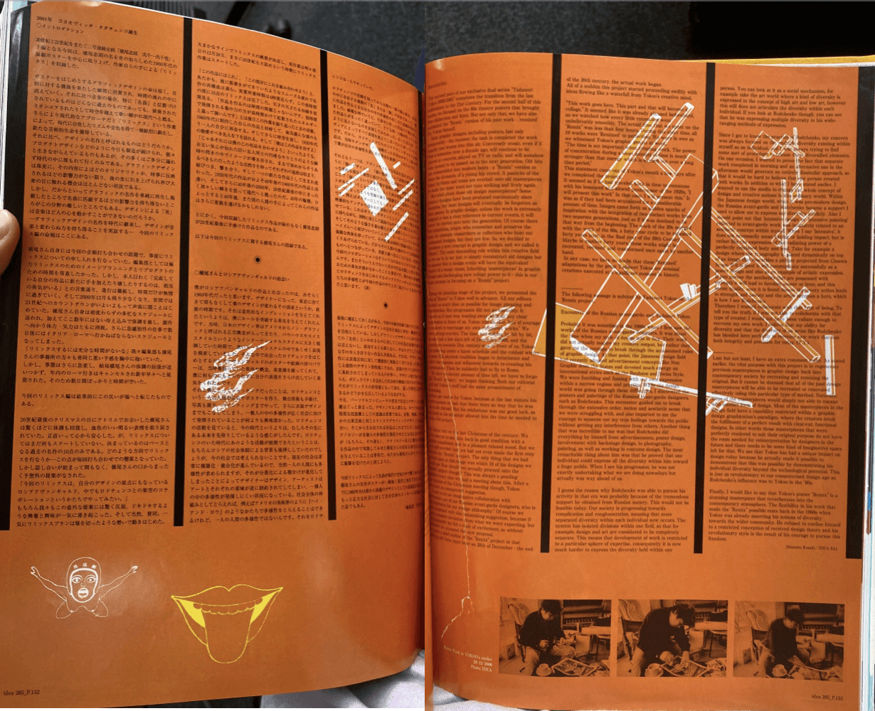
Figure 37 IDEA Issue 285 ‘Tadanori Yokoo’
Muroga expresses that he ‘wanted to introduce the same attitude of the published works into the design of the magazine itself. But this object driven approach got a little out of control, so we tried to find a better balance between ambitious content and ambitious design.’ (Offermanns, 2016). Muroga admits that in the drive to make IDEA a collectable object itself, it may have become lost in the task. In the efforts to become as interesting as the work, the priority of the content is lost. Some of Muroga’s contents pages follow no pattern or form, in 288 (Fig.38 pg. 31), the contents page is only half a page, with the ink and paper being so similar in colour that the only way to read it is through the reflection of light on the area. In 289 (Fig.39 pg. 31) the contents page is reduced to a square that unfolds to reveal the contents, it requires an engagement with the reader in order to be seen. I believe this is part of the object driven approach going out of control as in later issues (Fig. 40, 41, 42), the contents page is reverted to a single full page. There is still experimentation with the construction and colour of the page, but it returns to a more easily digestible design.
Figure 38 IDEA Issue 288 ‘Contents’
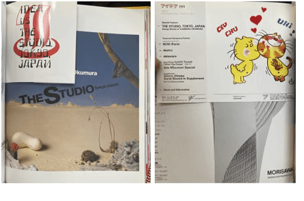
Figure 39 IDEA Issue 289 ‘Contents’
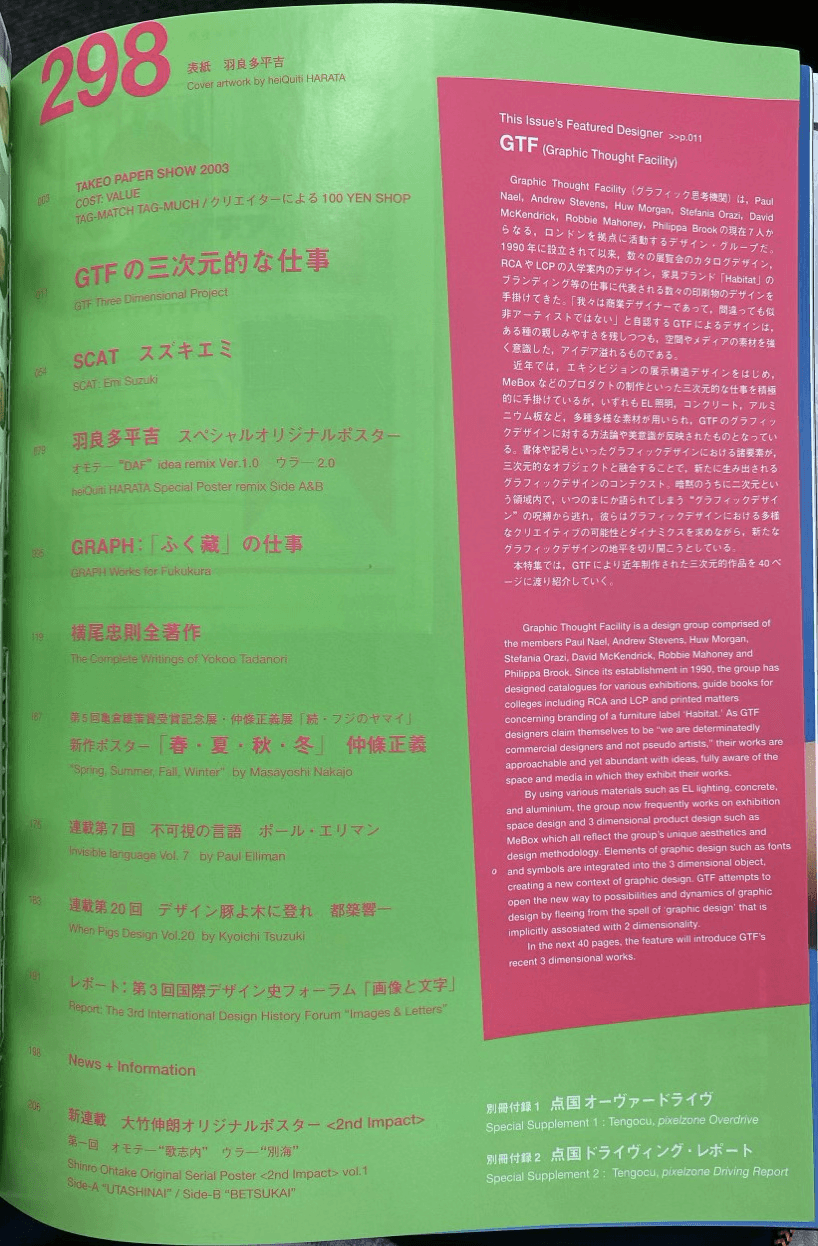
Figure 40 IDEA Issue 298 ‘Contents’
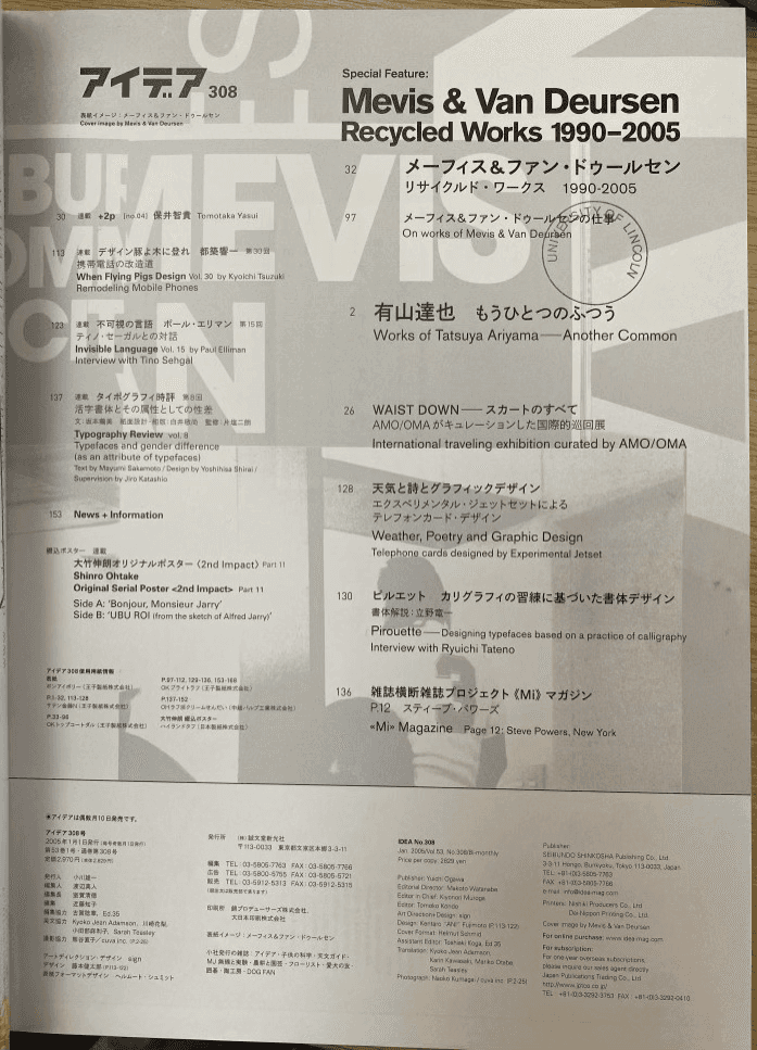
Figure 41 IDEA Issue 308 ‘Contents’
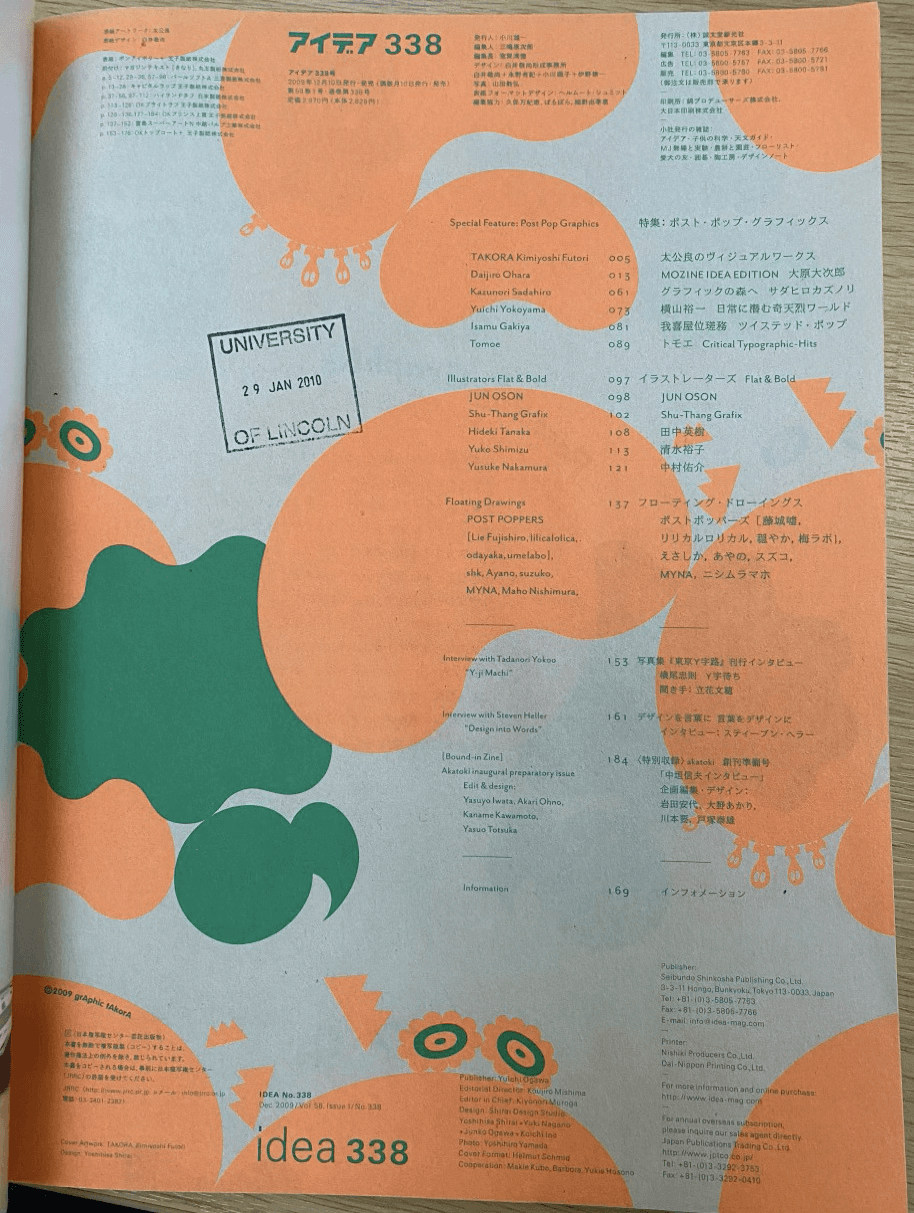
Figure 42 IDEA Issue 338 ‘Contents’
According to Ian Lynam’s timeline of Japanese Graphic Design (Fig. 43), IDEA’s editorial focus shifted to Japanese design in 2010. IDEA is made to both interact with the public by trying to both introduce what design should be whilst also appeasing the audience already built, Muroga regards ‘graphic culture as a fundamental human activity—a basic form of human interaction’ (Offermanns, 2016). This editorial shift was made in reaction to the culture feeling lost and perhaps underrepresented in an international magazine, Muroga chooses to interact more with the local culture. This change is most evident in Issue 368 (Fig. 44) where the magazine is flipped around, the back cover is the front, and the front is the back. However, although a departure from its previous forms, to see it as a surprise would be a western view. It is a Japanese magazine that has decided, for an issue, to return to a more cultural way of reading, from right to left. This is an example of the magazine being created with the surrounding culture in mind.
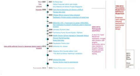
Figure 43 Ian Lynam’s Timeline of Japanese Graphic Design
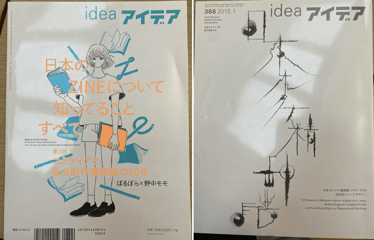
Figure 44 IDEA Issue 368 ‘Front and Back Cover’
When creating the magazine there is an expectation that the content and style of the magazine will influence other designers especially as ‘young graphic designers are still dealing with questions of cultural identity in a globalized world, but they also have to struggle with a culturally and economically fragmented Japanese society.’ (Offermanns, 2016). These designers would use the magazine to inspire and inform their own designs which would filter into their own published work, thus creating a reaction within the society. IDEA became both an example of and encouragement towards what Japanese design should be and uses its pages and content to inspire and lead the next generation of designers.
Madoka Nishi revealed that ‘The question for us is: How do you get people who are not interested in print into the idea that, from a single sheet of paper, you can bring about change?’ (Giles, 2020). IDEA has developed from a magazine, not just be collected and read, but made to inspire change and to help people build upon their own ideas, that could then snowball into something greater that impacts society and the way they view design. Nishi also outlines what the purpose of the magazine is. No longer an archival reference, she expresses that ‘We want Idea to be something that spawns new ideas.’ (Giles, 2020). This echoes Muroga’s sentiment about the cultural impact the magazine strives to achieve, under Nishi’s direction IDEA will flourish and continue to be an important cultural asset.
Comparative Discussion
In IDEA issue 382 “an alternative history of graphic design in Japan” is the topic of the front cover, the article is on the exhibition of the same name that was inspired by the history and longevity of IDEA magazine. The same exhibition is reviewed in Eye 96, this makes for an interesting comparison as we can view the history of IDEA magazine through the initial intended audience and then the western audience’s reaction to it. In IDEA the exhibition was said to be created as ‘an endeavour to let graphic designers express their own perceptions of history and their own influence. IDEA provided the ideal vehicle for this.’ (Goto, 2018, p. 129) In the Eye article, Alexandre Dios admits that ‘the Western visitor is bound to take away inspiration and references’ (Dios, 2018 p. 100) whereas IDEA views the exhibition as a vital documentation of the history and people that led them to the present. Having different reactions to the same exhibition all comes down to the culture and the way they view design. This evidence that cultures react differently to the same design is an explanation for why each magazine has evolved differently, even when created for the same purpose. Both magazines have evolved as pieces of design themselves, each change reflecting the shifts in their publishers, editors and cultural contexts.
Cleveland reasoned that ‘possible experimentation with the visual grammar is more possible in narrow readership spreads without alienating the readership’ (Cleveland, 2005). Although popular magazines, both Eye and IDEA cover a relatively niche topic. However, since both are created by designers themselves, they have a deeper understanding of their audiences, who in majority, are also designers. With a readership that is assumed to be intellectually
interested in the magazine and in design, there should be no fear of alienating the readership with visual changes, instead experimentation with visual grammar is a necessity to maintain interest from the readership. A lack of visual change would turn the reader away as the experimentation and focus on meticulous design content is what drew them to the magazines to begin with. Both magazines are made with the hope that the cultures and styles within the magazine would filter into and inspire the society in which they are read. Significant design and designers are covered so that they will generate an impact in the design worlds that they function within.
Conclusion
In conclusion, having carried out extensive research and analysis of both Eye and IDEA, it is clear that culture alters the development of design elements in print. The design elements used, and the design choices made are reactions to the advancements and attitudes of the surrounding society. The magazines created are products of their time and are either reflections of how a culture feels towards design at that time, or are they are aspirations for what current design culture should be moving towards. Design elements are in a symbiotic relationship with the culture, either the culture shifts the demeanour of the elements, or the design elements are chosen in an attempt to shift the culture.
In IDEA issue 200 in 1987 it was discussed how IDEA was being created in order to make graphic design be respected as a cultural asset in an economically orientated society. This is similar to Eye’s first purpose, from 1991, which was to take graphic designer’s work as seriously as the other fields in the arts. Graphic design work was given a platform in Eye to be critiqued seriously for the first time. The goal was to make graphic design work be respected more within the culture. It is in this sense that culture affects what the role of design is within the society. The design changes are a reaction to the perceived role at the time. If design is not respected, its role is now to sway the culture’s view and increase understanding of design. Any subsequent design decisions are made with this purpose in mind.
Once design became a respected field, but the surrounding design culture felt lost, then the magazine now takes on a different role, its purpose now is to lead and inspire the culture. This is again reflected in the design of the magazine, the design remains confident, but design elements are chosen with the intention to inspire, which leads to a lot more freedom and experimentation when it comes to design decisions. Design elements are the solution for the communication between audience and editor, the editor feeds on the energy of the culture and responds through the magazine by altering the visual grammar. Each design choice is made to produce a calculated reaction from the audience in an attempt to shift the culture.
If this question was to be answered again, in order to generate a more concrete understanding of how culture has affected graphical elements in print, a quantitative and qualitative approach should be used. I would recommend the methodology used by Melissa McMullen, in her visual analysis of the changes in Vogue. McMillen ‘coded the design elements of type, image, color, and layout visible on each page of editorial content from each magazine edition’ (McMullen, 2022). The quantitative data was combined with an interpretive textual analysis, as well as a critical textual analysis, in order to ‘explore the meanings created by the use and combination of these design elements’ and ‘evaluate the larger cultural and social contexts’ (McMullen, 2022) that the magazine functions within. Using this methodology would create highly accurate information that could be used alongside secondary sources to generate firmer conclusions about when and why design elements changed in reaction to the culture. Having graphable data would also make for more accurate comparisons between the two magazines. Potentially being able to visually pinpoint when they might have followed the same design trends. It could be possible to answer if similarities and differences in design elements have similar causations or how the same elements are used to generate differing reactions due to the cultural differences.
Appendix
Eye Contents Page Timeline 1991-2023
Figure 45 Eye Magazine Contents Pages Timeline
IDEA Contents Page Timeline 1964-2023
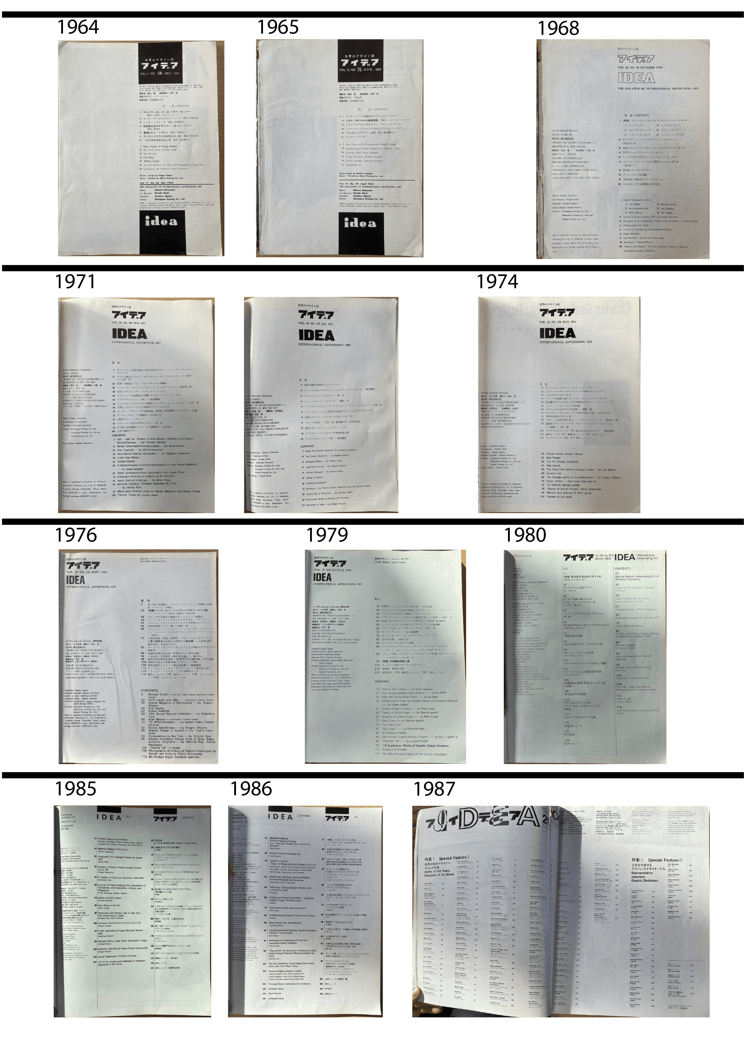
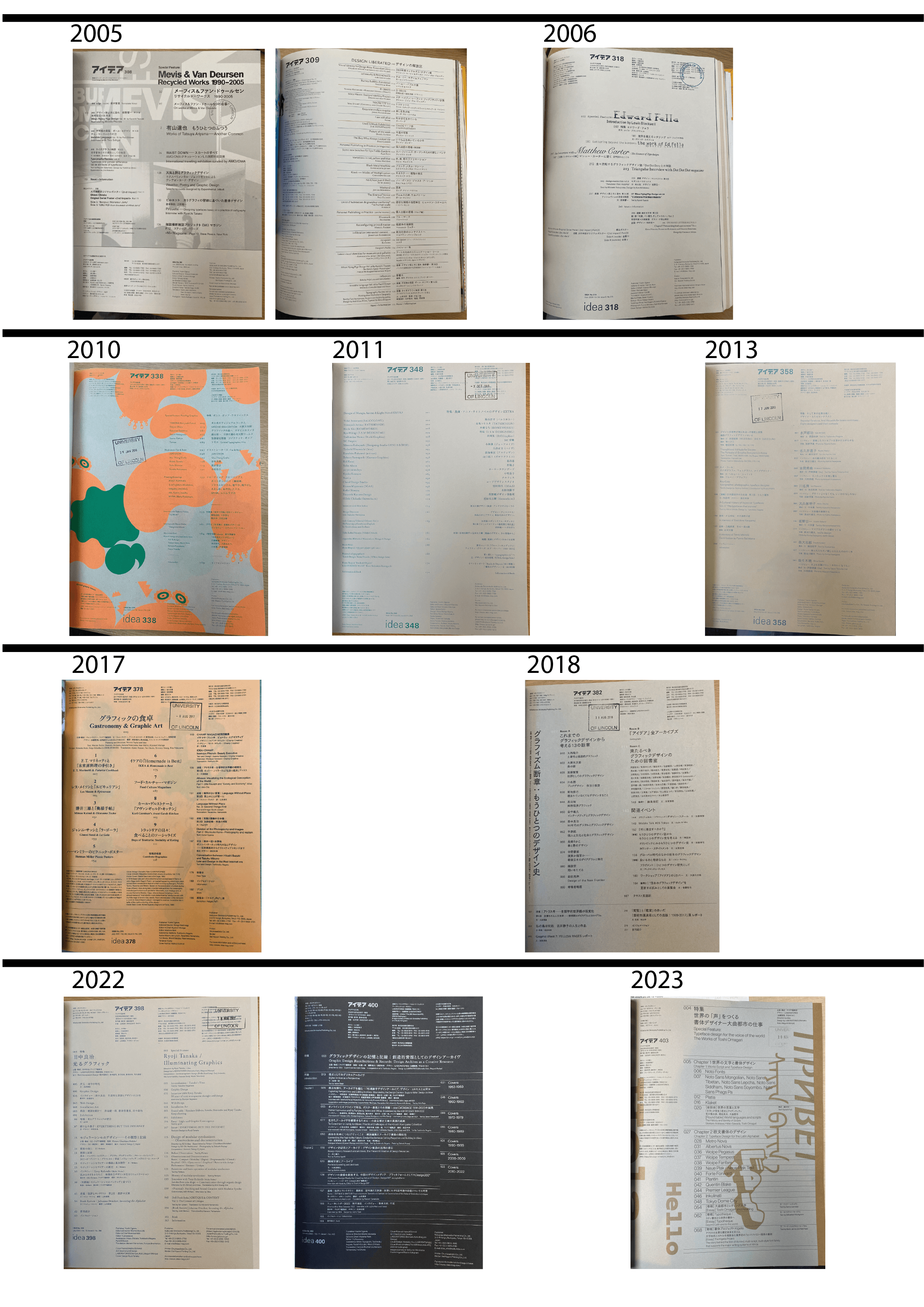
Figure 46 IDEA Magazine Contents Pages Timeline
Reference List:
Ambrose, G. and Harris, P. (2006). The Visual Dictionary of Graphic Design. Lausanne: Ava.
Batic, G. (2004). Institute of Network Cultures | Max Bruinsma Interview. [online] networkcultures.org. Available at: https://networkcultures.org/blog/2004/12/27/max-bruinsma-interview/ [Accessed 31 Mar. 2024].
Brunisma, M. (1999). Eye Issue 32 Editorial . Eye, 8(32), pp.3–4.
Brunisma, M. (2000). Making a Magazine in the Real World: Mars Calling Earth. [online] maxbruinsma.nl. Available at: https://maxbruinsma.nl/index1.html?dot.html [Accessed 31 Mar. 2024].
誠文堂新光社 (2018). Fragments of Graphism: An Alternative History of Graphic Desgn in Japan. [online] Idea. Available at: https://www.idea-mag.com/en/event/fragments-of-graphism/ [Accessed 1 Apr. 2024].
Cleveland, P. (2005). How much visual power can a magazine take? Design Studies, 26(3), pp.271–317. doi:https://doi.org/10.1016/j.destud.2004.05.007.
Dauppe, M.-A. (2011). Critical Frameworks for Graphic Design: Graphic Design and Visual Culture. Design Principles and Practices: An International Journal—Annual Review, 5(5), pp.489–498. doi:https://doi.org/10.18848/1833-1874/cgp/v05i05/38183.
Del Val, W. (2020). Eye Magazine at 100. [online] Designers & Books. Available at: https://www.designersandbooks.com/blog/eye-magazine-at-100.
Dios, A. (2018). Japanese Traces. Eye, [online] (96), pp.100–101. Available at: https://www.eyemagazine.com/review/article/japanese-traces.
Forceville, C. (1999). Educating the eye? Kress and Van Leeuwen’s Reading Images: The Grammar of Visual Design (1996). Language and Literature, 8(2), pp.163–178. doi:https://doi.org/10.1177/096394709900800204.
Giles, N. (2020). Tokyo’s manifesto for graphic design still relevant 66 years on. [online] Nikkei Asia. Available at: https://asia.nikkei.com/Life-Arts/Arts/Tokyo-s-manifesto-for-graphic-design-still-relevant-66-years-on [Accessed 4 Apr. 2024].
Goto, T. (2018). An Exhibition Attempt to Update ‘Japanese Graphic Design’.
IDEA, (382), p.129.
Heller, S. (1997). Rick Poynor, design writer and editor. PRINT, [online] 51(5), Sep., p.40. Available at: https://library.lincoln.ac.uk/items/eds/bth/501135?query=author%3A%28Poynor%2 C+Rick%29&resultsUri=items%3Fquery%3Dauthor%253A%2528Poynor%252C% 2BRick%2529%26target%3Deds%26facet%255B0%255D%3Dfulltext%253Ayes& facet%5B0%5D=fulltext%3Ayes&target=eds.
Hogarth, M. (2019). An eye for quality. [online] InPublishing. Available at: https://www.inpublishing.co.uk/articles/an-eye-for-quality-14793 [Accessed 2 Apr. 2024].
Kress, G. and Van Leeuwen, T. (2002). Colour as a Semiotic Mode: Notes for a Grammar of Colour. Visual Communication, 1(3), pp.343–368.
Kress, G. and van Leeuwen, T. (2020). Reading Images. Third edition. | London; New York: Routledge, 2021.: Routledge. doi:https://doi.org/10.4324/9781003099857.
Lamwatt, C. (2019). Eye 96 and Eye 97: Inside Eye’s Two-Part Magazine Special with John L. Walters and Simon Esterson. [online] The Society of Publication Designers. Available at: https://www.spd.org/behind-the-scenes/eye-96-and-eye-97.
Leborg, C. (2006). Visual grammar. [online] New York: Princeton Architectural Press. Available at: https://archive.org/details/visualgrammar0000lebo/page/94/mode/2up.
Leslie, J. (2016). Independence : 12 interviews with magazine makers. [online] London: Magculture Ltd. Available at: https://magculture.com/blogs/journal/john-l-walters-eye.
Li, W. (2022). The New Life and Translation of Traditional Culture in Modern Context from Japanese Graphic Design. International Journal of Social Science and Education Research, [online] 5(1), pp.537–545. doi:https://doi.org/10.6918/IJOSSER.202201_5(1).0084.
Lynam, I. (2015). Publishing in an age of pervasive design: An interview with IDEA magazine’s Kiyonori Muroga. [online] The Japan Times. Available at: https://www.japantimes.co.jp/culture/2015/09/19/books/publishing-age-pervasive-design-interview-idea-magazines-kiyonori-muroga/ [Accessed 4 Apr. 2024].
magCulture (2017). John L Walters, Eye. [online] magCulture. Available at: https://magculture.com/blogs/journal/john-l-walters-eye.
MARKO GOLUB (2020). JOHN L. WALTERS (Eye magazine): ‘Write about what is in front of you, and don’t let the reader go to sleep’. [online] Hrvatsko dizajnersko društvo / Croatian Designers Association. Available at: https://dizajn.hr/blog/john-l-walters-eye-magazine-write-front-dont-let-reader-go-sleep/ [Accessed 2 Apr. 2024].
Mcmullen, M. (2022). Localizing Graphic Design in a Global Media Environment: A Visual Social Semiotic Analysis of Vogue. International Journal of Communication, [online] 16(16), pp.4523–4542. Available at: https://ijoc.org/index.php/ijoc/article/viewFile/18961/3901.
Midalia, S. (1999). Gender and Literary Studies: An Introduction. [online] the UWA Profiles and Research Repository, Perth: The University of Western Australia.
Available at: https://research-repository.uwa.edu.au/en/publications/gender-and-literary-studies-an-introduction [Accessed 2 Apr. 2024].
Moerdisuroso, I. (2017). Social Semiotics and Visual Grammar: A Contemporary Approach to Visual Text Research. International Journal of Creative and Arts Studies, 1(1), p.80. doi:https://doi.org/10.24821/ijcas.v1i1.1574.
Nørgaard, N. (2009). The Semiotics of Typography in Literary Texts. A Multimodal Approach. Orbis Litterarum, [online] 64(2), pp.141–160. doi:https://doi.org/10.1111/j.1600-0730.2008.00949.x.
Offermanns, I. (2016). Inter Graphic View | Dialogue. [online] intergraphicview.com. Available at: http://intergraphicview.com/dialogue/6 [Accessed 4 Apr. 2024].
Porter, M. (2018). The Contents. Eye, (96), p.48.
Robelo, P. (2014). Zoom in to the Layers of Graphic Design. [Thesis] Available at: https://digitalcommons.georgiasouthern.edu/honors-theses/45/.
Roberts, S. and Philip, R. (2006). The grammar of visual design. Australasian Journal of Educational Technology, 22(2). doi:https://doi.org/10.14742/ajet.1299.
Scratching the Surface, (2018). [Podcast] Jarrett Fuller. 21 Mar. Available at: https://scratchingthesurface.fm/post/172090509780/69-john-l-walters.
Segi, S. (1987). The Design and Culture. IDEA, (200), Jan., pp.148–149.
Spencer, H. (1960). Typographica 13. The Print Arkive. Available at: https://www.theprintarkive.co.uk/products/typographica-13-new-series?variant=36922320126104.
Takeuchi, Y. (2007). Attention to Typography in the Magazine ‘Advertising World’: from ‘Designed Letters’ to ‘Layout’ of ‘Letterpress Type’. Journal of the Japan Society of Design, 51(1). doi:https://doi.org/10.18910/51139.
Thuy, T.T.H. (2017). READING IMAGES - THE GRAMMAR OF VISUAL DESIGN.
VNU Journal of Foreign Studies, 33(6). doi:https://doi.org/10.25073/2525-2445/vnufs.4217.
Van Leeuwen, T. (2005). Typographic meaning. Visual Communication, 4(2), pp.137–143. doi:https://doi.org/10.1177/1470357205053749.
Walters, J. (2018). A magazine is more than content. Eye, (96), p.21.
Yuan, Y. and Guoyuan, T. (2022). An Empirical Study on Imagery and Emotional Response in Chinese Poetry Translation—The Visual Grammar Perspective.
Frontiers in Psychology, 13. doi:https://doi.org/10.3389/fpsyg.2022.872497.
Bibliography
AIGA (n.d.). Resources | Design History Resources and Archives | AIGA. [online] www.aiga.org. Available at: https://www.aiga.org/resources/design-history-resources-and-archives.
Alexander, M. (1978). Language as Social Semiotic. Hodder Education.
Ambrose, G. and Harris, P. (2006). The Visual Dictionary of Graphic Design. Lausanne: Ava.
Batic, G. (2004). Institute of Network Cultures | Max Bruinsma Interview. [online] networkcultures.org. Available at: https://networkcultures.org/blog/2004/12/27/max-bruinsma-interview/ [Accessed 31 Mar. 2024].
Bazzini, D.G., Pepper, A., Swofford, R. and Cochran, K. (2015). How Healthy are Health Magazines? A Comparative Content Analysis of Cover Captions and Images of Women’s and Men’s Health Magazine. Sex Roles, 72(5-6), pp.198–210. doi:https://doi.org/10.1007/s11199-015-0456-2.
Bierut, M. (2004). The World in Two Footnotes. [online] Design Observer. Available at: https://designobserver.com/feature/the-world-in-two-footnotes/2637.
Braxton, M. and Kohei, S. (2017). Interview with Sugiura Kōhei (2013). Review of Japanese Culture and Society, [online] 29, pp.289–293. Available at: https://www.jstor.org/stable/48629203?seq=3 [Accessed 14 Apr. 2024].
Brunisma, M. (1999). Eye Issue 32 Editorial . Eye, 8(32), pp.3–4.
Brunisma, M. (2000). Making a Magazine in the Real World: Mars Calling Earth. [online] maxbruinsma.nl. Available at: https://maxbruinsma.nl/index1.html?dot.html [Accessed 31 Mar. 2024].
Cardello, J. (2019). History of grids: from the printing press to modern web design | Webflow Blog. [online] Webflow. Available at: https://webflow.com/blog/history-of-grids.
誠文堂新光社 (2018). Fragments of Graphism: An Alternative History of Graphic Desgn in Japan. [online] Idea. Available at: https://www.idea-mag.com/en/event/fragments-of-graphism/ [Accessed 1 Apr. 2024].
Cleveland, P. (2005). How much visual power can a magazine take? Design Studies, 26(3), pp.271–317. doi:https://doi.org/10.1016/j.destud.2004.05.007.
Dauppe, M.-A. (2011). Critical Frameworks for Graphic Design: Graphic Design and Visual Culture. Design Principles and Practices: An International Journal—Annual Review, 5(5), pp.489–498. doi:https://doi.org/10.18848/1833-1874/cgp/v05i05/38183.
Del Val, W. (2020). Eye Magazine at 100. [online] Designers & Books. Available at: https://www.designersandbooks.com/blog/eye-magazine-at-100.
Dios, A. (2018). Japanese Traces. Eye, [online] (96), pp.100–101. Available at: https://www.eyemagazine.com/review/article/japanese-traces.
Dyer, J. and Deakin, N. (2022). Graphic Events.
Edmonson, B. (2001). Idea magazine. [online] Design Week. Available at: https://www.designweek.co.uk/issues/15-march-2001/idea-magazine/ [Accessed 14 Apr. 2024].
Eskilson, S. (2007). Graphic Design : a New History. 2nd ed. New Haven, Connecticut: Yale University Press.
Feng, D. and O’Halloran, K.L. (2012). Representing emotive meaning in visual images: A social semiotic approach. Journal of Pragmatics, 44(14), pp.2067–2084. doi:https://doi.org/10.1016/j.pragma.2012.10.003.
Foncubierta-Rodríguez, A., Henning Müller and Depeursinge, A. (2017). From visual words to a visual grammar: using language modelling for image classification. arXiv (Cornell University). doi:https://doi.org/10.48550/arxiv.1703.05571.
Forceville, C. (1999). Educating the eye? Kress and Van Leeuwen’s Reading Images: The Grammar of Visual Design (1996). Language and Literature, 8(2), pp.163–178. doi:https://doi.org/10.1177/096394709900800204.
George, T. (2023). What is Secondary Research? | Definition, Types, & Examples. [online] Scribbr. Available at: https://www.scribbr.co.uk/research-methods/secondary-research-explained/.
Giles, N. (2020). Tokyo’s manifesto for graphic design still relevant 66 years on. [online] Nikkei Asia. Available at: https://asia.nikkei.com/Life-Arts/Arts/Tokyo-s-manifesto-for-graphic-design-still-relevant-66-years-on [Accessed 4 Apr. 2024].
Goto, T. (2018). An Exhibition Attempt to Update ‘Japanese Graphic Design’.
IDEA, (382), p.129.
Heller, S. (1997). Rick Poynor, design writer and editor. PRINT, [online] 51(5), Sep., p.40. Available at: https://library.lincoln.ac.uk/items/eds/bth/501135?query=author%3A%28Poynor%2 C+Rick%29&resultsUri=items%3Fquery%3Dauthor%253A%2528Poynor%252C% 2BRick%2529%26target%3Deds%26facet%255B0%255D%3Dfulltext%253Ayes& facet%5B0%5D=fulltext%3Ayes&target=eds.
Hogarth, M. (2019). An eye for quality. [online] InPublishing. Available at: https://www.inpublishing.co.uk/articles/an-eye-for-quality-14793 [Accessed 2 Apr. 2024].
Husni, S. (2018). John L. Walters: The Editor Who Keeps An ‘Eye’ On Graphic Design Worldwide. The Mr. MagazineTM Interview. [online] Mr. Magazine.
Available at: https://mrmagazine.me/2018/12/05/john-l-walters-the-editor-who-keeps-an-eye-on-graphic-design-worldwide-the-mr-magazine-interview/.
Kaiser, A. (2006). Constructing Modernity: Japanese Graphic Design from 1900 to 1930. Art History Faculty of the School of Art/College of DAAP University of Cincinnati , [online] 10(1). Available at: https://etd.ohiolink.edu/acprod/odb_etd/ws/send_file/send?accession=ucin114771 7044&disposition=inline.
Kawashima, K. (2004). Interpersonal Relationships in Japanese and Australian Women’s Magazines: A Case Study. Conference of the Australian Linguistics Society, [online] 1. Available at: https://ses.library.usyd.edu.au/bitstream/handle/2123/100/ALS-20050630-KK.pdf?sequence=1&isAllowed=y.
King, L. (2019). How to Not Be Befuddled by Japanese Design. [online] Medium. Available at: https://medium.com/swlh/how-not-to-be-bamboozled-by-japanese-design-ad385a58e3dc.
Kirca, S. (2000). Popularizing Feminism : A Comparative Case Study of British and Turkish Women’s Magazines . Centre for British and Comparative Cultural Studies at the University of Warwick. [online] Available at: https://wrap.warwick.ac.uk/36413/1/WRAP_THESIS_Kirca_2000.pdf.
Kress, G. and Van Leeuwen, T. (2002). Colour as a Semiotic Mode: Notes for a Grammar of Colour. Visual Communication, 1(3), pp.343–368.
Kress, G. and van Leeuwen, T. (2020). Reading Images. Third edition. | London; New York: Routledge, 2021.: Routledge. doi:https://doi.org/10.4324/9781003099857.
Lamont, M. (2023). Why Graphic Culture Matters by Rick Poynor - Design Reviewed. [online] Design Reviewed. Available at: https://designreviewed.com/why-graphic-culture-matters-by-rick-poynor/ [Accessed 14 Apr. 2024].
Lamwatt, C. (2019). Eye 96 and Eye 97: Inside Eye’s Two-Part Magazine Special with John L. Walters and Simon Esterson. [online] The Society of Publication
Designers. Available at: https://www.spd.org/behind-the-scenes/eye-96-and-eye-97.
Leborg, C. (2006). Visual grammar. [online] New York: Princeton Architectural Press. Available at: https://archive.org/details/visualgrammar0000lebo/page/94/mode/2up.
Leslie, J. (2016). Independence : 12 interviews with magazine makers. [online] London: Magculture Ltd. Available at: https://magculture.com/blogs/journal/john-l-walters-eye.
Li, W. (2022). The New Life and Translation of Traditional Culture in Modern Context from Japanese Graphic Design. International Journal of Social Science and Education Research, [online] 5(1), pp.537–545. doi:https://doi.org/10.6918/IJOSSER.202201_5(1).0084.
Lynam, I. (2014). Misruptions / Disruptions - An interactive timeline of Japanese graphic design magazines. [online] Design Made in Japan. Available at: https://designmadeinjapan.com/magazine/graphic-design/misruptions-disruptions-an-interactive-timeline-of-japanese-graphic-design-magazines/ [Accessed 14 Apr. 2024].
Lynam, I. (2015). Publishing in an age of pervasive design: An interview with IDEA magazine’s Kiyonori Muroga. [online] The Japan Times. Available at: https://www.japantimes.co.jp/culture/2015/09/19/books/publishing-age-pervasive-design-interview-idea-magazines-kiyonori-muroga/ [Accessed 4 Apr. 2024].
Lynam, I. (2022). Ian Lynam Design» Blog Archive» Critique & Context. [online] IanLynam.com. Available at: https://ianlynam.com/work/critique-context/ [Accessed 14 Apr. 2024].
magCulture (2017). John L Walters, Eye. [online] magCulture. Available at: https://magculture.com/blogs/journal/john-l-walters-eye.
MARKO GOLUB (2020). JOHN L. WALTERS (Eye magazine): ‘Write about what is in front of you, and don’t let the reader go to sleep’. [online] Hrvatsko dizajnersko društvo / Croatian Designers Association. Available at: https://dizajn.hr/blog/john-l-walters-eye-magazine-write-front-dont-let-reader-go-sleep/ [Accessed 2 Apr. 2024].
May, T. (2023). Print’s not dead: the best magazines for graphic design inspiration. [online] Creative Boom. Available at: https://www.creativeboom.com/resources/prints-not-dead-the-best-magazines-for-graphic-design-inspiration/.
McDonald, S. (2022). Japanese Graphic Design: Why So Many Creatives Love It. [online] Linearity blog. Available at: https://www.linearity.io/blog/japanese-graphic-design/.
Mcmullen, M. (2022). Localizing Graphic Design in a Global Media Environment: A Visual Social Semiotic Analysis of Vogue. International Journal of Communication, [online] 16(16), pp.4523–4542. Available at: https://ijoc.org/index.php/ijoc/article/viewFile/18961/3901.
Meggs, P. (2020a). Graphic design - Graphic design, 1945–75 | Britannica. In: Encyclopædia Britannica. [online] Available at: https://www.britannica.com/art/graphic-design/Graphic-design-1945-75.
Meggs, P.B. (2020b). Graphic design - Postwar graphic design in Japan | Britannica. In: Encyclopædia Britannica. [online] Available at: https://www.britannica.com/art/graphic-design/Postwar-graphic-design-in-Japan.
Midalia, S. (1999). Gender and Literary Studies: An Introduction. [online] the UWA Profiles and Research Repository, Perth: The University of Western Australia.
Available at: https://research-repository.uwa.edu.au/en/publications/gender-and-literary-studies-an-introduction [Accessed 2 Apr. 2024].
Moerdisuroso, I. (2017). Social Semiotics and Visual Grammar: A Contemporary Approach to Visual Text Research. International Journal of Creative and Arts Studies, 1(1), p.80. doi:https://doi.org/10.24821/ijcas.v1i1.1574.
Morley, M. (2017). Cover Story: What the Stack Awards Winner Tells us About the New Rules of Magazine Design. [online] Eye on Design. Available at: https://eyeondesign.aiga.org/cover-story-what-the-stack-awards-winner-tells-us-about-the-new-rules-of-magazine-design/.
Nagahara, Y. (n.d.). A Brief History of Digital Media and Japanese Graphic Design
| JAGDA. [online] dm.jagda.or.jp. Available at: https://dm.jagda.or.jp/history/ [Accessed 14 Apr. 2024].
Nagase, E. (2016). Seven rules for perfect Japanese typography. [online] AQ writes. Available at: https://medium.com/aq-writes/seven-rules-for-perfect-japanese-typography-c377fbf49d5 [Accessed 14 Apr. 2024].
Nallaperumal, S. (2015). items Magazine. [online] Fonts in Use. Available at: https://fontsinuse.com/uses/8601/items-magazine.
Newark, Q. (2023). Eye Magazine | Blog | WAVE. [online] Eye Magazine. Available at: https://www.eyemagazine.com/blog/post/nothing-is-real [Accessed 14 Apr. 2024].
Nørgaard, N. (2009). The Semiotics of Typography in Literary Texts. A Multimodal Approach. Orbis Litterarum, [online] 64(2), pp.141–160. doi:https://doi.org/10.1111/j.1600-0730.2008.00949.x.
Novin, G. (n.d.). A History of Graphic Design: Chapter 58 ; History of Layout Design and Modern Newspaper & Magazins. [online] A History of Graphic Design. Available at: https://guity-novin.blogspot.com/2012/04/modern-newspaper-magazine-layouts.html [Accessed 14 Apr. 2024].
Offermanns, I. (2016). Inter Graphic View | Dialogue. [online] intergraphicview.com. Available at: http://intergraphicview.com/dialogue/6 [Accessed 4 Apr. 2024].
Oyama, R. (1999). Visual semiotics : a study of images in Japanese advertisements. [online] discovery.ucl.ac.uk. Available at: https://discovery.ucl.ac.uk/id/eprint/10019140.
Oyama, R. (2000). Visual Communication across Cultures. Journal of Intercultural Communication, 2(1), pp.1–12. doi:https://doi.org/10.36923/jicc.v20i1.373.
Poole, B. (2013). The History of Graphic Design. [online] PRINT Magazine. Available at: https://www.printmag.com/design-books/the-history-of-graphic-design/.
Porter, M. (2018). The Contents. Eye, (96), p.48.
Robelo, P. (2014). Zoom in to the Layers of Graphic Design. [Thesis] Available at: https://digitalcommons.georgiasouthern.edu/honors-theses/45/.
Roberts, S. (2023). History of Graphic Design: Tracing Growth of Graphic Expression. [online] www.theknowledgeacademy.com. Available at: https://www.theknowledgeacademy.com/blog/history-of-graphic-design/.
Roberts, S. and Philip, R. (2006). The grammar of visual design. Australasian Journal of Educational Technology, 22(2). doi:https://doi.org/10.14742/ajet.1299.
Scratching the Surface, (2018). [Podcast] Jarrett Fuller. 21 Mar. Available at: https://scratchingthesurface.fm/post/172090509780/69-john-l-walters.
Segi, S. (1987). The Design and Culture. IDEA, (200), Jan., pp.148–149.
Serafini, F. (2011). Expanding Perspectives for Comprehending Visual Images in Multimodal Texts. Journal of Adolescent & Adult Literacy, 54(5), pp.342–350. doi:https://doi.org/10.1598/jaal.54.5.4.
Spencer, H. (1960). Typographica 13. The Print Arkive. Available at: https://www.theprintarkive.co.uk/products/typographica-13-new-series?variant=36922320126104.
Takeuchi, Y. (2007). Attention to Typography in the Magazine ‘Advertising World’: from ‘Designed Letters’ to ‘Layout’ of ‘Letterpress Type’. Journal of the Japan Society of Design, 51(1). doi:https://doi.org/10.18910/51139.
Thuy, T.T.H. (2017). READING IMAGES - THE GRAMMAR OF VISUAL DESIGN.
VNU Journal of Foreign Studies, 33(6). doi:https://doi.org/10.25073/2525-2445/vnufs.4217.
Van Leeuwen, T. (2005). Typographic meaning. Visual Communication, 4(2), pp.137–143. doi:https://doi.org/10.1177/1470357205053749.
Walters, J. (2018a). A magazine is more than content. Eye, (96), p.21.
Walters, J. (2018b). Eye Magazine | Blog | Independence day. [online] Eye Magazine. Available at: https://www.eyemagazine.com/blog/post/independence-day [Accessed 14 Apr. 2024].
Weinreich, C. (2018). Slanted in Tokyo. [online] slanted. Available at: https://www.slanted.de/slanted-in-tokyo/ [Accessed 14 Apr. 2024].
Wikipedia (2024). Eye (magazine). [online] Wikipedia. Available at: https://en.wikipedia.org/wiki/Eye_(magazine) [Accessed 14 Apr. 2024].
Wikipedia Contributers (2020). Rick Poynor. [online] Wikipedia. Available at: https://en.wikipedia.org/wiki/Rick_Poynor.
Wikipedia Contributors (2019). Timeline of Japanese history. [online] Wikipedia. Available at: https://en.wikipedia.org/wiki/Timeline_of_Japanese_history.
Yuan, Y. and Guoyuan, T. (2022). An Empirical Study on Imagery and Emotional Response in Chinese Poetry Translation—The Visual Grammar Perspective.
Frontiers in Psychology, 13. doi:https://doi.org/10.3389/fpsyg.2022.872497.